
>>>
It’s the Inequality, Stupid
 Illustrations by Jason Schneider
Eleven charts that explain everything that’s wrong with America.
— By Dave Gilson and Carolyn Perot
Share
How Rich Are the Superrich?
A huge share of the nation’s economic growth over the past 30 years has gone to the top one-hundredth of one percent, who now make an average of $27 million per household. The average income for the bottom 90 percent of us? $31,244.


Note: The 2007 data (the most current) doesn’t reflect the impact of the housing market crash. In 2007, the bottom 60% of Americans had 65% of their net worth tied up in their homes. The top 1%, in contrast, had just 10%. The housing crisis has no doubt further swelled the share of total net worth held by the superrich.
Winners Take All
The superrich have grabbed the bulk of the past three decades’ gains.

Out of Balance
A Harvard business prof and a behavioral economist recently asked more than 5,000 Americans how they thought wealth is distributed in the United States. Most thought that it’s more balanced than it actually is. Asked to choose their ideal distribution of wealth, 92% picked one that was even more equitable.

Capitol Gain
Why Washington is closer to Wall Street than Main Street.

| member | max. est. net worth |
|---|---|
| Rep. Darrell Issa (R-Calif.) | $451.1 million |
| Rep. Jane Harman (D-Calif.) | $435.4 million |
| Rep. Vern Buchanan (R-Fla.) | $366.2 million |
| Sen. John Kerry (D-Mass.) | $294.9 million |
| Rep. Jared Polis (D-Colo.) | $285.1 million |
| Sen. Mark Warner (D-Va.) | $283.1 million |
| Sen. Herb Kohl (D-Wisc.) | $231.2 million |
| Rep. Michael McCaul (R-Texas) | $201.5 million |
| Sen. Jay Rockefeller (D-W.Va.) | $136.2 million |
| Sen. Dianne Feinstein (D-Calif.) | $108.1 million |
| combined net worth: | $2.8 billion |

 Congressional data from 2009. Family net worth data from 2007. Sources: Center for Responsive Politics; US Census; Edward Wolff, Bard College.
Who’s Winning?
For a healthy few, it’s getting better all the time.

YOUR LOSS,THEIR GAIN
How much income have you given up for the top 1 percent?
| INCOME GROUP | TOTAL LOSS/GAIN IN ANNUAL INCOME* |
AVERAGE LOSS/GAIN PER HOUSEHOLD PER YEAR* |
|---|---|---|
| TOP 1% | $673 billion more | $597,241 more |
| 96-99 | $140 billion more | $29,895 more |
| 91-95 | $29 billion more | $4,912 more |
| 81-90 | $43 billion less | $3,733 less |
| 61-80 | $194 billion less | $8,598 less |
| 41-60 | $224 billion less | $10,100 less |
| 21-40 | $189 billion less | $8,582 less |
| BOTTOM 20% | $136 billion less | $5,623 less |
* Compared to what incomes would have been had all income groups seen the same growth rate in 1979-2005 as they did during previous decades.
Source: Jacob Hacker, Yale University; Paul Pierson, UC-Berkeley
Sources
Income distribution: Emmanuel Saez (PDF)
Net worth: Edward Wolff (PDF)Household income/income share: Congressional Budget OfficeReal vs. desired distribution of wealth: Michael I. Norton and Dan Ariely(PDF)
Net worth of Americans vs. Congress: Federal Reserve (average); Center for Responsive Politics (Congress)
Your chances of being a millionaire: Calculation based on data from Wolff (PDF); US Census (household and population data)
Member of Congress’ chances: Center for Responsive Politics
Wealthiest members of Congress: Center for Responsive Politics
Tax cut votes: New York Times (Senate; House)
Wall street profits, 2007-2009: New York State Comptroller (PDF)
Unemployment rate, 2007-2009: Bureau of Labor Statistics
Home equity, 2007-2009: Federal Reserve, Flow of Funds data, 1995-2004 and 2005-2009 (PDFs)
CEO vs. worker pay: Economic Policy Institute
Historic tax rates: Calculations based on data from The Tax Foundation
Federal tax revenue: Joint Committee on Taxation (PDF)Read also: Kevin Drum on the decline of Big Labor, the rise of Big Business, and why the Obama era fizzled so soon.
Dave Gilson is a senior editor at Mother Jones. For more of his stories, click here. Get Dave Gilson’s RSS feed.
>>>
Why America is on the Brink of Class Warfare
(And why we should be if we aren’t.)
72% (nearly three quarters) of all American wealth is controlled by the richest 10%. (This is the highest it has ever been since statistics started being kept. This actually includes the “Robber Baron” years of the “ultra rich” before Congress started regulating business.)
The bottom ninety percent control only 28% of the wealth.
The average annual income of the top 1% in the country is $1,137,684.
The average annual income of the top 10% is $164,647.
The average annual income of the bottom 90% is $31,294.
Your chance of being a millionaire – 1 in 22.
Your chance of being a millionaire if you are in Congress – 1 in 2.
The ten richest members of Congress control over 2 billion dollars between them.
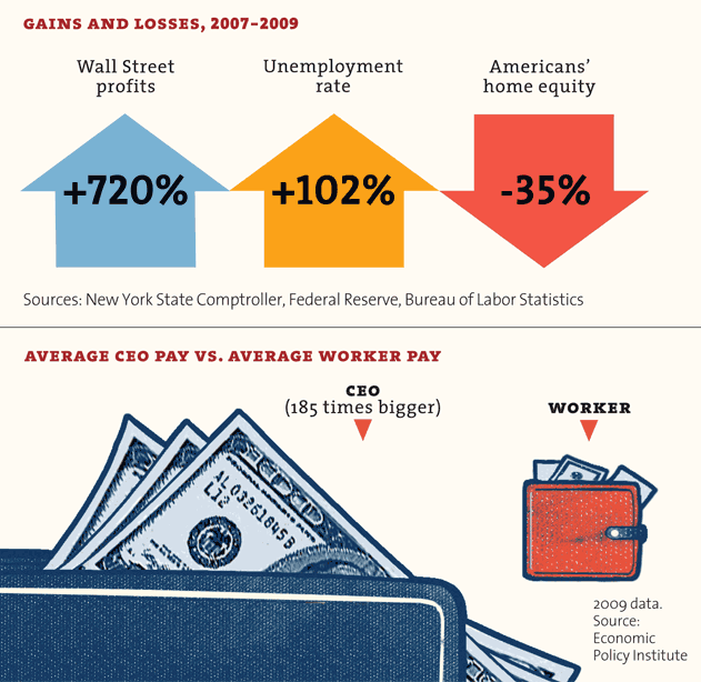
In the last two years Wall Street profits gained over 700%. The unemployment rate went up over 100%. American’s home equity went down over 35%.
The average CEO salary is 185 times that of the average worker.
Due to tax cuts, the tax rate of the average millionaire is now the lowest it’s been since 1930.
Sources include: University of California, Berkley; Harvard Business School; Duke University; US Census; Center for Responsive Politics; Bard College; New York State Comptroller; Federal Reserve, Bureau of Labor Statistics; The Tax Foundation; The Economic Policy Institute and (amazingly) The Senate Joint Committee on Taxation.
I copied the bulk of this from an article in Mother Jones Magazine.
http://motherjones.com/politics/2011/02/income-inequality-in-america-chart-graph
Other research was done independently on the internet and can be verified from the listed sources.
>>>
Wealth, Income, and Powerby G. William DomhoffSeptember 2005 (updated January 2011)This document presents details on the wealth and income distributions in the United States, and explains how we use these two distributions as power indicators. Some of the information may come as a surprise to many people. In fact, I know it will be a surprise and then some, because of a recent study (Norton & Ariely, 2010) showing that most Americans (high income or low income, female or male, young or old, Republican or Democrat) have no idea just how concentrated the wealth distribution actually is. More on that a bit later. As far as the income distribution, the most amazing numbers on income inequality will come last, showing the dramatic change in the ratio of the average CEO’s paycheck to that of the average factory worker over the past 40 years. First, though, some definitions. Generally speaking, wealth is the value of everything a person or family owns, minus any debts. However, for purposes of studying the wealth distribution, economists define wealth in terms of marketable assets, such as real estate, stocks, and bonds, leaving aside consumer durables like cars and household items because they are not as readily converted into cash and are more valuable to their owners for use purposes than they are for resale (see Wolff, 2004, p. 4, for a full discussion of these issues). Once the value of all marketable assets is determined, then all debts, such as home mortgages and credit card debts, are subtracted, which yields a person’s net worth. In addition, economists use the concept of financial wealth — also referred to in this document as “non-home wealth” — which is defined as net worth minus net equity in owner-occupied housing. As Wolff (2004, p. 5) explains, “Financial wealth is a more ‘liquid’ concept than marketable wealth, since one’s home is difficult to convert into cash in the short term. It thus reflects the resources that may be immediately available for consumption or various forms of investments.” We also need to distinguish wealth from income. Income is what people earn from work, but also from dividends, interest, and any rents or royalties that are paid to them on properties they own. In theory, those who own a great deal of wealth may or may not have high incomes, depending on the returns they receive from their wealth, but in reality those at the very top of the wealth distribution usually have the most income. (But it’s important to note that for the rich, most of that income does not come from “working”: in 2008, only 19% of the income reported by the 13,480 individuals or families making over $10 million came from wages and salaries. See Norris, 2010, for more details.) As you read through these numbers, please keep in mind that they are usually two or three years out of date because it takes time for one set of experts to collect the basic information and make sure it is accurate, and then still more time for another set of experts to analyze it and write their reports. It’s also the case that the infamous housing bubble of the first eight years of the 21st century inflated some of the wealth numbers. So far there are only tentative projections — based on the price of housing and stock in July 2009 — on the effects of the Great Recession on the wealth distribution. They suggest that average Americans have been hit much harder than wealthy Americans. Edward Wolff, the economist we draw upon the most in this document, concludes that there has been an “astounding” 36.1% drop in the wealth (marketable assets) of the median household since the peak of the housing bubble in 2007. By contrast, the wealth of the top 1% of households dropped by far less: just 11.1%. So as of April 2010, it looks like the wealth distribution is even more unequal than it was in 2007. (See Wolff, 2010 for more details.) One final general point before turning to the specifics. People who have looked at this document in the past often asked whether progressive taxation reduces some of the income inequality that exists before taxes are paid. The answer: not by much, if we count all of the taxes that people pay, from sales taxes to property taxes to payroll taxes (in other words, not just income taxes). And the top 1% of income earners, who average over $1 million a year, actually pay a smaller percentage of their incomes to taxes than the 9% just below them. These findings are discussed in detail near the end of this document. The Wealth DistributionIn the United States, wealth is highly concentrated in a relatively few hands. As of 2007, the top 1% of households (the upper class) owned 34.6% of all privately held wealth, and the next 19% (the managerial, professional, and small business stratum) had 50.5%, which means that just 20% of the people owned a remarkable 85%, leaving only 15% of the wealth for the bottom 80% (wage and salary workers). In terms of financial wealth (total net worth minus the value of one’s home), the top 1% of households had an even greater share: 42.7%. Table 1 and Figure 1 present further details drawn from the careful work of economist Edward N. Wolff at New York University (2010).
In terms of types of financial wealth, the top one percent of households have 38.3% of all privately held stock, 60.6% of financial securities, and 62.4% of business equity. The top 10% have 80% to 90% of stocks, bonds, trust funds, and business equity, and over 75% of non-home real estate. Since financial wealth is what counts as far as the control of income-producing assets, we can say that just 10% of the people own the United States of America.
Inheritance and estate taxesFigures on inheritance tell much the same story. According to a study published by the Federal Reserve Bank of Cleveland, only 1.6% of Americans receive $100,000 or more in inheritance. Another 1.1% receive $50,000 to $100,000. On the other hand, 91.9% receive nothing (Kotlikoff & Gokhale, 2000). Thus, the attempt by ultra-conservatives to eliminate inheritance taxes — which they always call “death taxes” for P.R. reasons — would take a huge bite out of government revenues (an estimated $1 trillion between 2012 and 2022) for the benefit of the heirs of the mere 0.6% of Americans whose death would lead to the payment of any estate taxes whatsoever (Citizens for Tax Justice, 2010b). It is noteworthy that some of the richest people in the country oppose this ultra-conservative initiative, suggesting that this effort is driven by anti-government ideology. In other words, few of the ultra-conservative and libertarian activists behind the effort will benefit from it in any material way. However, a study (Kenny et al., 2006) of the financial support for eliminating inheritance taxes discovered that 18 super-rich families (mostly Republican financial donors, but a few who support Democrats) provide the anti-government activists with most of the money for this effort. (For more infomation, including the names of the major donors, download the article from United For a Fair Economy’s Web site.) Actually, ultra-conservatives and their wealthy financial backers may not have to bother to eliminate what remains of inheritance taxes at the federal level. The rich already have a new way to avoid inheritance taxes forever — for generations and generations — thanks to bankers. After Congress passed a reform in 1986 making it impossible for a “trust” to skip a generation before paying inheritance taxes, bankers convinced legislatures in many states to eliminate their “rules against perpetuities,” which means that trust funds set up in those states can exist in perpetuity, thereby allowing the trust funds to own new businesses, houses, and much else for descendants of rich people, and even to allow the beneficiaries to avoid payments to creditors when in personal debt or sued for causing accidents and injuries. About $100 billion in trust funds has flowed into those states so far. You can read the details on these “dynasty trusts” (which could be the basis for an even more solidified “American aristocracy”) in a New York Times opinion piece published in July 2010 by Boston College law professor Roy Madoff, who also has a book on this and other new tricks: Immortality and the Law: The Rising Power of the American Dead (Yale University Press, 2010). Home ownership & wealthFor the vast majority of Americans, their homes are by far the most significant wealth they possess. Figure 3 comes from the Federal Reserve Board’s Survey of Consumer Finances (via Wolff, 2010) and compares the median income, total wealth (net worth, which is marketable assets minus debt), and non-home wealth (which earlier we called financial wealth) of White, Black, and Hispanic households in the U.S.
Besides illustrating the significance of home ownership as a source of wealth, the graph also shows that Black and Latino households are faring significantly worse overall, whether we are talking about income or net worth. In 2007, the average white household had 15 times as much total wealth as the average African-American or Latino household. If we exclude home equity from the calculations and consider only financial wealth, the ratios are in the neighborhood of 100:1. Extrapolating from these figures, we see that 70% of white families’ wealth is in the form of their principal residence; for Blacks and Hispanics, the figures are 95% and 96%, respectively. And for all Americans, things are getting worse: as the projections to July 2009 by Wolff (2010) make clear, the last few years have seen a huge loss in housing wealth for most families, making the gap between the rich and the rest of America even greater, and increasing the number of households with no marketable assets from 18.6% to 24.1%. Do Americans know their country’s wealth distribution?A remarkable study (Norton & Ariely, 2010) reveals that Americans have no idea that the wealth distribution (defined for them in terms of “net worth”) is as concentrated as it is. When shown three pie charts representing possible wealth distributions, 90% or more of the 5,522 respondents — whatever their gender, age, income level, or party affiliation — thought that the American wealth distribution most resembled one in which the top 20% has about 60% of the wealth. In fact, of course, the top 20% control about 85% of the wealth (refer back to Table 1 and Figure 1 in this document for a more detailed breakdown of the numbers). Even more striking, they did not come close on the amount of wealth held by the bottom 40% of the population. It’s a number I haven’t even mentioned so far, and it’s shocking: the lowest two quintiles hold just 0.3% of the wealth in the United States. Most people in the survey guessed the figure to be between 8% and 10%, and two dozen academic economists got it wrong too, by guessing about 2% — seven times too high. Those surveyed did have it about right for what the 20% in the middle have; it’s at the top and the bottom that they don’t have any idea of what’s going on. Americans from all walks of life were also united in their vision of what the “ideal” wealth distribution would be, which may come as an even bigger surprise than their shared misinformation on the actual wealth distribution. They said that the ideal wealth distribution would be one in which the top 20% owned between 30 and 40 percent of the privately held wealth, which is a far cry from the 85 percent that the top 20% actually own. They also said that the bottom 40% — that’s 120 million Americans — should have between 25% and 30%, not the mere 8% to 10% they thought this group had, and far above the 0.3% they actually had. In fact, there’s no country in the world that has a wealth distribution close to what Americans think is ideal when it comes to fairness. So maybe Americans are much more egalitarian than most of them realize about each other, at least in principle and before the rat race begins. Figure 4, reproduced with permission from Norton & Ariely’s article in Perspectives on Psychological Science, shows the actual wealth distribution, along with the survey respondents’ estimated and ideal distributions, in graphic form.
David Cay Johnston, a retired tax reporter for the New York Times, published an excellent summary of Norton & Ariely’s findings (Johnston, 2010b; you can download the article from Johnston’s Web site). Historical contextNumerous studies show that the wealth distribution has been extremely concentrated throughout American history, with the top 1% already owning 40-50% in large port cities like Boston, New York, and Charleston in the 19th century. It was very stable over the course of the 20th century, although there were small declines in the aftermath of the New Deal and World II, when most people were working and could save a little money. There were progressive income tax rates, too, which took some money from the rich to help with government services. Then there was a further decline, or flattening, in the 1970s, but this time in good part due to a fall in stock prices, meaning that the rich lost some of the value in their stocks. By the late 1980s, however, the wealth distribution was almost as concentrated as it had been in 1929, when the top 1% had 44.2% of all wealth. It has continued to edge up since that time, with a slight decline from 1998 to 2001, before the economy crashed in the late 2000s and little people got pushed down again. Table 3 and Figure 5 present the details from 1922 through 2007.
Here are some dramatic facts that sum up how the wealth distribution became even more concentrated between 1983 and 2004, in good part due to the tax cuts for the wealthy and the defeat of labor unions: Of all the new financial wealth created by the American economy in that 21-year-period, fully 42% of it went to the top 1%. A whopping 94% went to the top 20%, which of course means that the bottom 80% received only 6% of all the new financial wealth generated in the United States during the ’80s, ’90s, and early 2000s (Wolff, 2007). The rest of the worldThanks to a 2006 study by the World Institute for Development Economics Research — using statistics for the year 2000 — we now have information on the wealth distribution for the world as a whole, which can be compared to the United States and other well-off countries. The authors of the report admit that the quality of the information available on many countries is very spotty and probably off by several percentage points, but they compensate for this problem with very sophisticated statistical methods and the use of different sets of data. With those caveats in mind, we can still safely say that the top 10% of the world’s adults control about 85% of global household wealth — defined very broadly as all assets (not just financial assets), minus debts. That compares with a figure of 69.8% for the top 10% for the United States. The only industrialized democracy with a higher concentration of wealth in the top 10% than the United States is Switzerland at 71.3%. For the figures for several other Northern European countries and Canada, all of which are based on high-quality data, see Table 4.
The Relationship Between Wealth and PowerWhat’s the relationship between wealth and power? To avoid confusion, let’s be sure we understand they are two different issues. Wealth, as I’ve said, refers to the value of everything people own, minus what they owe, but the focus is on “marketable assets” for purposes of economic and power studies. Power, as explained elsewhere on this site, has to do with the ability (or call it capacity) to realize wishes, or reach goals, which amounts to the same thing, even in the face of opposition (Russell, 1938; Wrong, 1995). Some definitions refine this point to say that power involves Person A or Group A affecting Person B or Group B “in a manner contrary to B’s interests,” which then necessitates a discussion of “interests,” and quickly leads into the realm of philosophy (Lukes, 2005, p. 30). Leaving those discussions for the philosophers, at least for now, how do the concepts of wealth and power relate? First, wealth can be seen as a “resource” that is very useful in exercising power. That’s obvious when we think of donations to political parties, payments to lobbyists, and grants to experts who are employed to think up new policies beneficial to the wealthy. Wealth also can be useful in shaping the general social environment to the benefit of the wealthy, whether through hiring public relations firms or donating money for universities, museums, music halls, and art galleries. Second, certain kinds of wealth, such as stock ownership, can be used to control corporations, which of course have a major impact on how the society functions. Tables 5a and 5b show what the distribution of stock ownership looks like. Note how the top one percent’s share of stock equity increased (and the bottom 80 percent’s share decreased) between 2001 and 2007.
Third, just as wealth can lead to power, so too can power lead to wealth. Those who control a government can use their position to feather their own nests, whether that means a favorable land deal for relatives at the local level or a huge federal government contract for a new corporation run by friends who will hire you when you leave government. If we take a larger historical sweep and look cross-nationally, we are well aware that the leaders of conquering armies often grab enormous wealth, and that some religious leaders use their positions to acquire wealth. There’s a fourth way that wealth and power relate. For research purposes, the wealth distribution can be seen as the main “value distribution” within the general power indicator I call “who benefits.” What follows in the next three paragraphs is a little long-winded, I realize, but it needs to be said because some social scientists — primarily pluralists — argue that who wins and who loses in a variety of policy conflicts is the only valid power indicator (Dahl, 1957, 1958; Polsby, 1980). And philosophical discussions don’t even mention wealth or other power indicators (Lukes, 2005). (If you have heard it all before, or can do without it, feel free to skip ahead to the last paragraph of this section) Here’s the argument: if we assume that most people would like to have as great a share as possible of the things that are valued in the society, then we can infer that those who have the most goodies are the most powerful. Although some value distributions may be unintended outcomes that do not really reflect power, as pluralists are quick to tell us, the general distribution of valued experiences and objects within a society still can be viewed as the most publicly visible and stable outcome of the operation of power. In American society, for example, wealth and well-being are highly valued. People seek to own property, to have high incomes, to have interesting and safe jobs, to enjoy the finest in travel and leisure, and to live long and healthy lives. All of these “values” are unequally distributed, and all may be utilized as power indicators. However, the primary focus with this type of power indicator is on the wealth distribution sketched out in the previous section. The argument for using the wealth distribution as a power indicator is strengthened by studies showing that such distributions vary historically and from country to country, depending upon the relative strength of rival political parties and trade unions, with the United States having the most highly concentrated wealth distribution of any Western democracy except Switzerland. For example, in a study based on 18 Western democracies, strong trade unions and successful social democratic parties correlated with greater equality in the income distribution and a higher level of welfare spending (Stephens, 1979). And now we have arrived at the point I want to make. If the top 1% of households have 30-35% of the wealth, that’s 30 to 35 times what they would have if wealth were equally distributed, and so we infer that they must be powerful. And then we set out to see if the same set of households scores high on other power indicators (it does). Next we study how that power operates, which is what most articles on this site are about. Furthermore, if the top 20% have 84% of the wealth (and recall that 10% have 85% to 90% of the stocks, bonds, trust funds, and business equity), that means that the United States is a power pyramid. It’s tough for the bottom 80% — maybe even the bottom 90% — to get organized and exercise much power. Income and PowerThe income distribution also can be used as a power indicator. As Table 6 shows, it is not as concentrated as the wealth distribution, but the top 1% of income earners did receive 17% of all income in the year 2003 and 21.3% in 2006. That’s up from 12.8% for the top 1% in 1982, which is quite a jump, and it parallels what is happening with the wealth distribution. This is further support for the inference that the power of the corporate community and the upper class have been increasing in recent decades.
The rising concentration of income can be seen in a special New York Times analysis by David Cay Johnston of an Internal Revenue Service report on income in 2004. Although overall income had grown by 27% since 1979, 33% of the gains went to the top 1%. Meanwhile, the bottom 60% were making less: about 95 cents for each dollar they made in 1979. The next 20% – those between the 60th and 80th rungs of the income ladder — made $1.02 for each dollar they earned in 1979. Furthermore, Johnston concludes that only the top 5% made significant gains ($1.53 for each 1979 dollar). Most amazing of all, the top 0.1% — that’s one-tenth of one percent — had more combined pre-tax income than the poorest 120 million people (Johnston, 2006). But the increase in what is going to the few at the top did not level off, even with all that. As of 2007, income inequality in the United States was at an all-time high for the past 95 years, with the top 0.01% — that’s one-hundredth of one percent — receiving 6% of all U.S. wages, which is double what it was for that tiny slice in 2000; the top 10% received 49.7%, the highest since 1917 (Saez, 2009). However, in an analysis of 2008 tax returns for the top 0.2% — that is, those whose income tax returns reported $1,000,000 or more in income (mostly from individuals, but nearly a third from couples) — it was found that they received 13% of all income, down slightly from 16.1% in 2007 due to the decline in payoffs from financial assets (Norris, 2010). And the rate of increase is even higher for the very richest of the rich: the top 400 income earners in the United States. According to another analysis by Johnston (2010a), the average income of the top 400 tripled during the Clinton Administration and doubled during the first seven years of the Bush Administration. So by 2007, the top 400 averaged $344.8 million per person, up 31% from an average of $263.3 million just one year earlier. (For another recent revealing study by Johnston, read “Is Our Tax System Helping Us Create Wealth?“). How are these huge gains possible for the top 400? It’s due to cuts in the tax rates on capital gains and dividends, which were down to a mere 15% in 2007 thanks to the tax cuts proposed by the Bush Administration and passed by Congress in 2003. Since almost 75% of the income for the top 400 comes from capital gains and dividends, it’s not hard to see why tax cuts on income sources available to only a tiny percent of Americans mattered greatly for the high-earning few. Overall, the effective tax rate on high incomes fell by 7% during the Clinton presidency and 6% in the Bush era, so the top 400 had a tax rate of 20% or less in 2007, far lower than the marginal tax rate of 35% that the highest income earners (over $372,650) supposedly pay. It’s also worth noting that only the first $106,800 of a person’s income is taxed for Social Security purposes (as of 2010), so it would clearly be a boon to the Social Security Fund if everyone — not just those making less than $106,800 — paid the Social Security tax on their full incomes. Do Taxes Redistribute Income?It is widely believed that taxes are highly progressive and, furthermore, that the top several percent of income earners pay most of the taxes received by the federal government. Both ideas are wrong because they focus on official, rather than “effective” tax rates and ignore payroll taxes, which are mostly paid by those with incomes below $100,000 per year. But what matters in terms of a power analysis is what percentage of their income people at different income levels pay to all levels of government (federal, state, and local) in taxes. If the less-well-off majority is somehow able to wield power, we would expect that the high earners would pay a bigger percentage of their income in taxes, because the majority figures the well-to-do would still have plenty left after taxes to make new investments and lead the good life. If the high earners have the most power, we’d expect them to pay about the same as everybody else, or less. Citizens for Tax Justice, a research group that’s been studying tax issues from its offices in Washington since 1979, provides the information we need. When all taxes (not just income taxes) are taken into account, the lowest 20% of earners (who average about $12,400 per year), paid 16.0% of their income to taxes in 2009; and the next 20% (about $25,000/year), paid 20.5% in taxes. So if we only examine these first two steps, the tax system looks like it is going to be progressive. And it keeps looking progressive as we move further up the ladder: the middle 20% (about $33,400/year) give 25.3% of their income to various forms of taxation, and the next 20% (about $66,000/year) pay 28.5%. So taxes are progressive for the bottom 80%. But if we break the top 20% down into smaller chunks, we find that progressivity starts to slow down, then it stops, and then it slips backwards for the top 1%. Specifically, the next 10% (about $100,000/year) pay 30.2% of their income as taxes; the next 5% ($141,000/year) dole out 31.2% of their earnings for taxes; and the next 4% ($245,000/year) pay 31.6% to taxes. You’ll note that the progressivity is slowing down. As for the top 1% — those who take in $1.3 million per year on average — they pay 30.8% of their income to taxes, which is a little less than what the 9% just below them pay, and only a tiny bit more than what the segment between the 80th and 90th percentile pays. What I’ve just explained with words can be seen more clearly in Figure 6.
We also can look at this information on income and taxes in another way by asking what percentage of all taxes various income levels pay. (This is not the same as the previous question, which asked what percentage of their incomes went to taxes for people at various income levels.) And the answer to this new question can be found in Figure 7. For example, the top 20% receives 59.1% of all income and pays 64.3% of all the taxes, so they aren’t carrying a huge extra burden. At the other end, the bottom 20%, which receives 3.5% of all income, pays 1.9% of all taxes.
So the best estimates that can be put together from official government numbers show a little bit of progressivity. But the details on those who earn millions of dollars each year are very hard to come by, because they can stash a large part of their wealth in off-shore tax havens in the Caribbean and little countries in Europe, starting with Switzerland. And there are many loopholes and gimmicks they can use, as summarized with striking examples in Free Lunch and Perfectly Legal, the books by Johnston that were mentioned earlier. For example, Johnston explains the ways in which high earners can hide their money and delay on paying taxes, and then invest for a profit what normally would be paid in taxes. Income inequality in other countriesThe degree of income inequality in the United States can be compared to that in other countries on the basis of the Gini coefficient, a mathematical ratio that allows economists to put all countries on a scale with values that range (hypothetically) from zero (everyone in the country has the same income) to 100 (one person in the country has all the income). On this widely used measure, the United States ends up 95th out of the 134 countries that have been studied — that is, only 39 of the 134 countries have worse income inequality. The U.S. has a Gini index of 45.0; Sweden is the lowest with 23.0, and South Africa is near the top with 65.0. The table that follows displays the scores for 22 major countries, along with their ranking in the longer list of 134 countries that were studied (most of the other countries are very small and/or very poor). In examining this table, remember that it does not measure the same thing as Table 4 earlier in this document, which was about the wealth distribution. Here we are looking at the income distribution, so the two tables won’t match up as far as rankings. That’s because a country can have a highly concentrated wealth distribution and still have a more equal distribution of income — both Switzerland and Sweden follow this pattern. So one thing that’s distinctive about the U.S. compared to other industrialized democracies is that both its wealth and income distributions are highly concentrated.
The impact of “transfer payments”As we’ve seen, taxes don’t have much impact on the income distribution, especially when we look at the top 1% or top 0.1%. Nor do various kinds of tax breaks and loopholes have much impact on the income distribution overall. That’s because the tax deductions that help those with lower incomes — such as the Earned Income Tax Credit (EITC), tax forgiveness for low-income earners on Social Security, and tax deductions for dependent children — are offset by the breaks for high-income earners (for example: dividends and capital gains are only taxed at a rate of 15%; there’s no tax on the interest earned from state and municipal bonds; and 20% of the tax deductions taken for dependent children actually go to people earning over $100,000 a year). But it is sometimes said that income inequality is reduced significantly by government programs that matter very much in the lives of low-income Americans. These programs provide “transfer payments,” which are a form of income for those in need. They include unemployment compensation, cash payments to the elderly who don’t have enough to live on from Social Security, Temporary Assistance to Needy Families (welfare), food stamps, and Medicaid. Thomas Hungerford (2009), a tax expert who works for the federal government’s Congressional Research Service, carried out a study for Congress that tells us on the real-world impact of transfer payments on reducing income inequality. Hungerford’s study is based on 2004 income data from an ongoing study of a representative sample of families at the University of Michigan, and it includes the effects of both taxes and four types of transfer payments (Social Security, Temporary Assistance to Needy Families, food stamps, and Medicaid). The table that follows shows the income inequality index (that is, the Gini coefficient) at three points along the way: (1.) before taxes or transfers; (2) after taxes are taken into account; and (3) after both taxes and transfer payments are included in the equation. (The Citizens for Tax Justice study of income and taxes for 2009, discussed earlier, included transfer payments as income, so that study and Hungerford’s have similar starting points. But they can’t be directly compared, because they use different years.)
As can be seen, Hungerford’s findings first support what we had learned earlier from the Citizens for Tax Justice study: taxes don’t do much to reduce inequality. They secondly reveal that transfer payments have a slightly larger impact on inequality than taxes, but not much. Third, his findings tell us that taxes and transfer payments together reduce the inequality index from .52 to .43, which is very close to the CIA’s estimate of .45 for 2008. In short, for those who ask if progressive taxes and transfer payments even things out to a significant degree, the answer is that while they have some effect, they don’t do nearly as much as in Canada, major European countries, or Japan. Income Ratios and Power: Executives vs. LaborersAnother way that income can be used as a power indicator is by comparing average CEO annual pay to average factory worker pay, something that has been done for many years by Business Week and, later, the Associated Press. The ratio of CEO pay to factory worker pay rose from 42:1 in 1960 to as high as 531:1 in 2000, at the height of the stock market bubble, when CEOs were cashing in big stock options. It was at 411:1 in 2005 and 344:1 in 2007, according to research by United for a Fair Economy. By way of comparison, the same ratio is about 25:1 in Europe. The changes in the American ratio from 1960 to 2007 are displayed in Figure 8, which is based on data from several hundred of the largest corporations.
It’s even more revealing to compare the actual rates of increase of the salaries of CEOs and ordinary workers; from 1990 to 2005, CEOs’ pay increased almost 300% (adjusted for inflation), while production workers gained a scant 4.3%. The purchasing power of the federal minimum wage actually declined by 9.3%, when inflation is taken into account. These startling results are illustrated in Figure 9.
Although some of the information I’ve relied upon to create this section on executives’ vs. workers’ pay is a few years old now, the AFL/CIO provides up-to-date information on CEO salaries at their Web site. There, you can learn that the median compensation for CEO’s in all industries as of early 2010 is $3.9 million; it’s $10.6 million for the companies listed in Standard and Poor’s 500, and $19.8 million for the companies listed in the Dow-Jones Industrial Average. Since the median worker’s pay is about $36,000, then you can quickly calculate that CEOs in general make 100 times as much as the workers, that CEO’s of S&P 500 firms make almost 300 times as much, and that CEOs at the Dow-Jones companies make 550 times as much. If you wonder how such a large gap could develop, the proximate, or most immediate, factor involves the way in which CEOs now are able to rig things so that the board of directors, which they help select — and which includes some fellow CEOs on whose boards they sit — gives them the pay they want. The trick is in hiring outside experts, called “compensation consultants,” who give the process a thin veneer of economic respectability. The process has been explained in detail by a retired CEO of DuPont, Edgar S. Woolard, Jr., who is now chair of the New York Stock Exchange’s executive compensation committee. His experience suggests that he knows whereof he speaks, and he speaks because he’s concerned that corporate leaders are losing respect in the public mind. He says that the business page chatter about CEO salaries being set by the competition for their services in the executive labor market is “bull.” As to the claim that CEOs deserve ever higher salaries because they “create wealth,” he describes that rationale as a “joke,” says the New York Times (Morgenson, 2005, Section 3, p. 1). Here’s how it works, according to Woolard:
The board of directors buys into what the CEO asks for because the outside consultant is an “expert” on such matters. Furthermore, handing out only modest salary increases might give the wrong impression about how highly the board values the CEO. And if someone on the board should object, there are the three or four CEOs from other companies who will make sure it happens. It is a process with a built-in escalator. As for why the consultants go along with this scam, they know which side their bread is buttered on. They realize the CEO has a big say-so on whether or not they are hired again. So they suggest a package of salaries, stock options and other goodies that they think will please the CEO, and they, too, get rich in the process. And certainly the top executives just below the CEO don’t mind hearing about the boss’s raise. They know it will mean pay increases for them, too. (For an excellent detailed article on the main consulting firm that helps CEOs and other corporate executives raise their pay, check out the New York Times article entitled “America’s Corporate Pay Pal”, which supports everything Woolard of DuPont claims and adds new information.) There’s a much deeper power story that underlies the self-dealing and mutual back-scratching by CEOs now carried out through interlocking directorates and seemingly independent outside consultants. It probably involves several factors. At the least, on the workers’ side, it reflects their loss of power following the all-out attack on unions in the 1960s and 1970s, which is explained in detail in an excellent book by James Gross (1995), a labor and industrial relations professor at Cornell. That decline in union power made possible and was increased by both outsourcing at home and the movement of production to developing countries, which were facilitated by the break-up of the New Deal coalition and the rise of the New Right (Domhoff, 1990, Chapter 10). It signals the shift of the United States from a high-wage to a low-wage economy, with professionals protected by the fact that foreign-trained doctors and lawyers aren’t allowed to compete with their American counterparts in the direct way that low-wage foreign-born workers are. (You also can read a quick version of my explanation for the “right turn” that led to changes in the wealth and income distributions in an article on this site, where it is presented in the context of criticizing the explanations put forward by other theorists.) On the other side of the class divide, the rise in CEO pay may reflect the increasing power of chief executives as compared to major owners and stockholders in general, not just their increasing power over workers. CEOs may now be the center of gravity in the corporate community and the power elite, displacing the leaders in wealthy owning families (e.g., the second and third generations of the Walton family, the owners of Wal-Mart). True enough, the CEOs are sometimes ousted by their generally go-along boards of directors, but they are able to make hay and throw their weight around during the time they are king of the mountain. The claims made in the previous paragraph need much further investigation. But they demonstrate the ideas and research directions that are suggested by looking at the wealth and income distributions as indicators of power. Further Information
ReferencesAFL-CIO (2010). Executive PayWatch: CEO Pay Database: Compensation by Industry. Retrieved February 8, 2010 from http://www.aflcio.org/corporatewatch/paywatch/ceou/industry.cfm. Anderson, S., Cavanagh, J., Collins, C., Lapham, M., & Pizzigati, S. (2008). Executive Excess 2008: How Average Taxpayers Subsidize Runaway Pay. Washington, DC: Institute for Policy Studies / United for a Fair Economy. Anderson, S., Cavanagh, J., Collins, C., Lapham, M., & Pizzigati, S. (2007). Executive Excess 2007: The Staggering Social Cost of U.S. Business Leadership. Washington, DC: Institute for Policy Studies / United for a Fair Economy. Anderson, S., Benjamin, E., Cavanagh, J., & Collins, C. (2006). Executive Excess 2006: Defense and Oil Executives Cash in on Conflict. Washington, DC: Institute for Policy Studies / United for a Fair Economy. Anderson, S., Cavanagh, J., Klinger, S., & Stanton, L. (2005). Executive Excess 2005: Defense Contractors Get More Bucks for the Bang. Washington, DC: Institute for Policy Studies / United for a Fair Economy. Central Intelligence Agency (2010). World Factbook: Country Comparison: Distribution of family income – Gini index. Retrieved October 26, 2010 from https://www.cia.gov/library/publications/the-world-factbook/rankorder/2172rank.html. Citizens for Tax Justice (2010b). State-by-State Estate Tax Figures: Number of Deaths Resulting in Estate Tax Liability Continues to Drop. Retrieved December 13, 2010 from http://www.ctj.org/pdf/estatetax2010.pdf. Citizens for Tax Justice (2010a). All Americans Pay Taxes. Retrieved April 15, 2010 from http://www.ctj.org/pdf/taxday2010.pdf. Dahl, R. A. (1957). The concept of power. Behavioral Science, 2, 202-210. Dahl, R. A. (1958). A critique of the ruling elite model. American Political Science Review, 52, 463-469. Davies, J. B., Sandstrom, S., Shorrocks, A., & Wolff, E. N. (2006). The World Distribution of Household Wealth. Helsinki: World Institute for Development Economics Research. Domhoff, G. W. (1990). The Power Elite and the State: How Policy Is Made in America. Hawthorne, NY: Aldine de Gruyter. Gross, J. A. (1995). Broken Promise: The Subversion of U.S. Labor Relations Policy. Philadelphia: Temple University Press. Hungerford, T. (2009). Redistribution effects of federal taxes and selected tax provisions. Washington: Congressional Research Service. Johnston, D. C. (2010b). United in Our Delusion. Retrieved October 12, 2010 from http://www.tax.com/taxcom/taxblog.nsf/Permalink/UBEN-8A6TUW?OpenDocument. Johnston, D. C. (2010a). Tax Rates for Top 400 Earners Fall as Income Soars, IRS Data. Retrieved February 23, 2010 from http://www.tax.com/taxcom/features.nsf/Articles/0DEC0EAA7E4D7A2B852576CD00714692?OpenDocument. Johnston, D. C. (2009, December 21). Is Our Tax System Helping Us Create Wealth? Tax Notes, pp. 1375-1377. Johnston, D. C. (2006, November 28). ’04 Income in U.S. Was Below 2000 Level. New York Times, p. C-1. Keister, L. (2005). Getting Rich: A Study of Wealth Mobility in America. New York: Cambridge University Press. Kenny, C., Lincoln, T., Collins, C., & Farris, L. (2006). Spending Millions to Save Billions: The Campaign of the Super Wealthy to Kill the Estate Tax. Washington, DC: Public Citizen / United for a Fair Economy. Kotlikoff, L., & Gokhale, J. (2000). The Baby Boomers’ Mega-Inheritance: Myth or Reality? Cleveland: Federal Reserve Bank of Cleveland. Lukes, S. (2005). Power: A Radical View (Second ed.). New York: Palgrave. Madoff, R. D. (2010, July 12). America Builds an Aristocracy. New York Times, p. A-19. Morgenson, G. (2005, October 23). How to slow runaway executive pay. New York Times, Section 3, p. 1. Norris, F. (2010, July 24). Off the Charts: In ’08 Downturn, Some Managed to Eke Out Millions. New York Times, p. B-3. Norton, M. I., & Ariely, D. (2010, forthcoming). Building a better America – one wealth quintile at a time. Perspectives on Psychological Science. Polsby, N. (1980). Community Power and Political Theory (Second ed.). New Haven, CT: Yale University Press. Russell, B. (1938). Power: A New Social Analysis. London: Allen and Unwin. Saez, E. (2009). Striking It Richer: The Evolution of Top Incomes in the United States (Update with 2007 Estimates). Retrieved August 28, 2009 from http://elsa.berkeley.edu/~saez/saez-UStopincomes-2007.pdf. Saez, E., & Piketty, T. (2003). Income Inequality in the United States, 1913-1998. Quarterly Journal of Economics, 118, 1-39. Shapiro, I., & Friedman, J. (2006). New, Unnoticed CBO Data Show Capital Income Has Become Much More Concentrated at the Top. Washington, DC: Center on Budget and Policy Priorities. Stephens, J. (1979). The Transition from Capitalism to Socialism. London: Macmillan. Wolff, E. N. (1996). Top Heavy. New York: The New Press. Wolff, E. N. (2004). Changes in household wealth in the 1980s and 1990s in the U.S. Working Paper No. 407. Annandale-on-Hudson, NY: The Levy Economics Institute of Bard College. Wolff, E. N. (2007). Recent trends in household wealth in the United States: Rising debt and the middle-class squeeze. Working Paper No. 502. Annandale-on-Hudson, NY: The Levy Economics Institute of Bard College. Wolff, E. N. (2010). Recent trends in household wealth in the United States: Rising debt and the middle-class squeeze – an update to 2007. Working Paper No. 589. Annandale-on-Hudson, NY: The Levy Economics Institute of Bard College. Wrong, D. (1995). Power: Its Forms, Bases, and Uses (Second ed.). New Brunswick: Transaction Publishers. |
|||||||||||||||||||||||||||||||||||||||||||||||||||||||||||||||||||||||||||||||||||||||||||||||||||||||||||||||||||||||||||||||||||||||||||||||||||||||||||||||||||||||||||||||||||||||||||||||||||||||||||||||||||||||||||||||||||||||||||||||||||||||||||||||||||||||||||||||||||||||||||||||||||||||||||||||||||||||||||||||||||||||||||||||||||||||||||||||||||||||||||||||||||||||||||||||||||||||||||||||||||||||||||||||||||||||||||||||||||||||||||||||||||||||||||||||||||||||
| All content ©2011 G. William Domhoff, unless otherwise noted. Unauthorized reproduction prohibited. Please direct technical questions regarding this Web site to Adam Schneider. | |||||||||||||||||||||||||||||||||||||||||||||||||||||||||||||||||||||||||||||||||||||||||||||||||||||||||||||||||||||||||||||||||||||||||||||||||||||||||||||||||||||||||||||||||||||||||||||||||||||||||||||||||||||||||||||||||||||||||||||||||||||||||||||||||||||||||||||||||||||||||||||||||||||||||||||||||||||||||||||||||||||||||||||||||||||||||||||||||||||||||||||||||||||||||||||||||||||||||||||||||||||||||||||||||||||||||||||||||||||||||||||||||||||||||||||||||||||||


 printable version of this page
>>
We hear a lot these days about how government spending has led to a deficit that could pose a major long-term threat if it goes unaddressed. It’s true that government has of late grown under both Democratic and Republican presidents. But deficit hawks often sidestep a no-less important trend: In recent decades, tax rates–especially for the rich–have been on the decline by historical standards. Everyone likes getting a tax cut, but it’s worth remembering that the shrinking of tax revenue has contributed to the deficit problem, just as spending has.
Via Felix Salmon, a fascinating (and strangely beautiful!) chart, compiled by Stephen Von Worley at the DataPointed blog, drives home that point, and a few others.

What to make of all those swirling lines? The chart shows how tax burdens for different income levels have fluctuated over the last century, adjusted for inflation. Blue areas represent a historically low tax burden for a specific income level, while red areas represent a historically high burden.
So in a nutshell, the chart shows that until around 1940, tax burdens were low for everyone, in historical terms. Then they rose sharply for everyone until about 1970. At that point, the rich and poor began to diverge. Those making around $10,000 to around $50,000 per year enjoyed a comparatively low-tax period in the 70s, but by the early 80s they were taxed slightly higher than the historical average. In the 2000s, their tax rate came back down a bit. By contrast, those making more than roughly $200,000 a year saw a sharp decrease in their tax burden starting in the 80s. That trend has continued to this day.
It’s clear, then, that across the board, today’s tax rates are low by historical standards–and for the rich they’re very low. If the bottom of the chart showed more red and less blue, our deficit problem would be a lot more manageable.
The chart also has implications for another topic we’ve written about here before–wealth and income inequality. As you can see, no one’s taxes today are particularly high by historical standards, but those making $1 million or more per year–that is, roughly the top 1 percent–enjoy the lowest burden, relative to past rates.
At a time when a horde of stats indicates that the gap between rich and poor has widened into chasm–and when Congress and the White House are set to argue again later this year about whether to permanently extend the Bush tax cuts for the rich–it’s well worth keeping this bigger picture in mind.
<><>
Tax Cuts Offer Most for Very Rich, Study Says
Top of Form
Bottom of Form
Published: January 8, 2007
WASHINGTON, Jan. 7 — Families earning more than $1 million a year saw their federal tax rates drop more sharply than any group in the country as a result of President Bush’s tax cuts, according to a new Congressional study.
The study, by the nonpartisan Congressional Budget Office, also shows that tax rates for middle-income earners edged up in 2004, the most recent year for which data was available, while rates for people at the very top continued to decline.
Based on an exhaustive analysis of tax records and census data, the study reinforced the sense that while Mr. Bush’s tax cuts reduced rates for people at every income level, they offered the biggest benefits by far to people at the very top — especially the top 1 percent of income earners.
Though tax cuts for the rich were bigger than those for other groups, the wealthiest families paid a bigger share of total taxes. That is because their incomes have climbed far more rapidly, and the gap between rich and poor has widened in the last several years.
The study offers ammunition to supporters and opponents of Mr. Bush’s tax cuts, which are all but certain to touch off a battle between the president and the Democrats who just took control of Congress.
Democratic leaders have taken pains to avoid an immediate fight over the tax cuts, most of which are scheduled to expire at the end of 2010. But Democrats are looking for ways to increase revenue well before then, in part because they want to spend more on education and energy without increasing the deficit.
Economists and tax analysts have long known that the biggest dollar value of Mr. Bush’s tax cuts goes to people at the very top income levels. One reason is that two of his signature measures, tax cuts on investment income and a steady reduction of estate taxes, overwhelmingly benefit the wealthiest households.
But the Congressional study offers additional insight because it incorporates information about what people paid in 2004, the first year in which taxpayers could take full advantage of the cuts on stock dividends and capital gains.
The study estimates that the effective federal income tax rate, which excludes payroll taxes for Social Security and Medicare, declined modestly for people in the middle- and lower-income categories.
Families in the middle fifth of annual earnings, who had average incomes of $56,200 in 2004, saw their average effective tax rate edge down to 2.9 percent in 2004 from 5 percent in 2000. That translated to an average tax cut of $1,180 per household, but the tax rate actually increased slightly from 2003.
Tax cuts were much deeper, and affected far more money, for families in the highest income categories. Households in the top 1 percent of earnings, which had an average income of $1.25 million, saw their effective individual tax rates drop to 19.6 percent in 2004 from 24.2 percent in 2000. The rate cut was twice as deep as for middle-income families, and it translated to an average tax cut of almost $58,000.
In its report, the Congressional Budget Office estimated that the overall effective federal tax rate edged up to 20 percent in 2004, from 19.8 percent the year before.
But even with that increase, Americans faced lower tax rates than any time since 1979. If President Bush has his way, those rates could decline even more as the estate tax on inherited wealth is gradually phased out by the start of 2010.
Mr. Bush and his Republican allies in Congress want to permanently extend that tax cut and almost all of the others that Congress passed in his first term. The cost of doing that would be more than $1 trillion over the next decade, a cost that would hit the Treasury at the same time that the spending on old-age benefits for retiring baby boomers begins to soar.
The budget office offered little commentary on its new estimates, but many of its numbers spoke for themselves.
The report shows that a comparatively small number of very wealthy households account for a very big share of total tax payments, and their share increased in the first four years after Mr. Bush’s tax cuts.
The top 1 percent of income earners paid about 36.7 percent of federal income taxes and 25.3 percent of all federal taxes in 2004. The top 20 percent of income earners paid 67.1 percent of all federal taxes, up from 66.1 percent in 2000, according to the budget office.
By contrast, families in the bottom 40 percent of income earners, those with incomes below $36,300, typically paid no federal income tax and received money back from the government. That so-called negative income tax stemmed mainly from the earned-income tax credit, a program that benefits low-income parents who are employed.
Put another way: rich families were the undisputed winners from President Bush’s tax cuts, but people in the bottom half of the earnings scale were not paying much in taxes anyway.
<>
Monday, November 22, 2010
Can we blame income inequality on Republicans?
Part V
The Great Divergence by Noah
9 The percentage of the labor force that used computers increased at a faster rate in the 1980s than in the 1990s, but it wasn’t until the mid-to-late late ‘90s that a majority of workers used computers.
Overall, pre-tax income increased 1.42 percent annually for the 20th percentile (poor and lowermiddle-class people) and 2 percent annually for the 95th percentile (upper-middle-class and rich people). The White House during this period was occupied by five Democrats (Truman, Kennedy, Johnson, Carter, Clinton) and six Republicans (Eisenhower, Nixon, Ford, Reagan, Bush I, Bush II). Bartels plotted out what the inequality trend would have been had only Democrats been president. He also plotted out what the trend would be had only Republicans been president.on politics,” Hacker and Pierson point out in their new book, Winner-Take-All Politics, “only a fairly small fraction is directly connected to electoral contests. The bulk of it goes to lobbying….” Corporations now spend more than $3 billion annually on lobbying, according to official records cited by Hacker and Pierson (which, they note, understate true expenditures). That’s nearly twice what corporations spent a decade ago.
Until recently, the consensus among academics—even most liberal ones—was quite different. Economists argued that the Great Divergence was the result not of Washington policymaking but of larger “exogenous” (external) and “secular” (long-term) forces. In June, the Congressional Budget Office calculated that spending by the federal government made up 23 percent of U.S. gross domestic product, after averaging 18.5 percent during the previous four decades. But even with federal spending at this unusually high level (necessitated by a severe recession), Washington’s nut remains less than one-quarter the size of the economy. Most of that nut is automatic “entitlement” spending over which Washington policymakers seldom exert much control. Brad DeLong, a liberal economist at Berkeley, expressed the prevailing view in 2006: “[T]he shifts in income inequality seem to me to be too big to be associated with anything the government does or did.”
My Slate colleague Mickey Kaus took this argument one step further in his 1992 book The End of Equality, positing that income inequality was the inevitable outgrowth of ever-more-ruthlessly efficient markets, and that government attempts to reverse it were certain to fail. “[Y]ou cannot
decide to keep all the nice parts of capitalism,” he wrote, “and get rid of all the nasty ones.” Instead, Kaus urged liberals to combat social inequality by nurturing egalitarian civic institutions (parks, schools, libraries, museums) and by creating some new ones (national health care, national service, a revived WPA) that remove many of life’s most important activities from the
“money sphere” altogether.
Finding ways to increase social equality is an important goal, and Kaus’s book remains a smart and provocative read. But the academic consensus that underlay Kaus’s argument (and Long’s more modest one) has lately started to crumble.
Economists and political scientists previously resisted blaming the Great Divergence on government mainly because it didn’t show up when you looked at the changing distribution of federal income taxes. Taxation is the most logical government activity to focus on, because it is literally redistribution: taking money from one group of people (through taxes) and handing it
over to another group (through government benefits and appropriations).
Another compelling reason to focus on taxation is that income-tax policy has changed very dramatically during the last 30 years. Before Ronald Reagan’s election in 1980, the top income tax bracket stood at or above 70 percent, where it had been since the Great Depression. (In the
Compression, as the economy boomed and income inequality dwindled, the top bracket resided at a level that even most Democrats would today call confiscatory. Reagan dropped the top bracket from 70 percent to 50 percent, and eventually pushed it all the way down to 28 percent. Since then, it has hovered between 30 percent and 40 percent. If President Obama lets George
W. Bush’s 2001 tax cut expire for families earning more than $250,000, as he’s expected to do, Tea Partiers will call him a Bolshevik. But at a whisker under 40 percent (up from 35), the top bracket would remain 30 to 50 percentage points below what it was under Presidents Eisenhower, Nixon, and Ford. That’s how much Reagan changed the debate.
But tax brackets, including the top one, tell you only the marginal tax rate, i.e., the rate on the last dollar earned. The percentage of total income that you actually pay in taxes is known as theeffective tax rate. That calculation looks at income taxed at various rates as you move from one
bracket to the next; it figures in taxes on capital gains and pensions; it figures in “imputed taxes” such as corporate and payroll taxes paid by your employer (on the theory that if your boss didn’t give this money to Uncle Sam he’d give it to you); and it removes from the total any money the
federal government paid you in Social Security, welfare, unemployment benefits, or some other benefit. Reagan lowered top marginal tax rates a lot, but he lowered top effective tax rates much less—and certainly not enough to make income-tax policy a major cause of the Great Divergence.
In 1979, the effective tax rate on the top 0.01 percent (i.e., rich people) was 42.9 percent, according to the Congressional Budget Office. By Reagan’s last year in office it was 32.2 percent. From 1989 to 2005 (the last year for which data are available), as income inequality continued to climb, the effective tax rate on the top 0.01 percent largely held steady; in most
years it remained in the low 30s, surging to 41 during Clinton’s first term but falling back during his second, where it remained. The change in the effective tax rate on the bottom 20 percent (i.e., poor and lower-middle-class people) was much more dramatic, but not in a direction that would
increase income inequality. Under Clinton, it dropped from 8 percent (about where it had stood since 1979) to 6.4 percent. Under George W. Bush, it fell to 4.3 percent.
Measuring tax impacts is not an exact science. There are many ways to define rich, poor, and middle class, and many variables to consider. Some experts have looked at the same data and concluded that effective tax rates have gone up slightly for people at high incomes. Others concluded they’ve gone down. The larger point is that you can’t really demonstrate that U.S. tax
policy had a large impact on the three-decade income inequality trend one way or the other. The inequality trend for pre-tax income during this period was much more dramatic. That’s why academics concluded that government policy didn’t affect U.S. income distribution very much.
But in recent years a few prominent economists and political scientists have suggested looking at the question somewhat differently. Rather than consider only effective tax rates, they recommend that we look at what MIT economists Frank Levy and Peter Temin call “institutions and norms.”
It’s somewhat vague phrase, but in practice what it mostly means is “stuff the government did, or didn’t do, in more ways than we can count.” In his 2007 book, The Conscience of a Liberal, Princeton economist and New York Times columnist Paul Krugman concludes that there is “a strong circumstantial case for believing that institutions and norms … are the big sources of rising inequality in the United States.” Krugman elaborated in his New York Times blog:
[T]he great reduction of inequality that created middle-class America between 1935 and
1945 was driven by political change; I believe that politics has also played an important
role in rising inequality since the 1970s. It’s important to know that no other advanced
economy has seen a comparable surge in inequality.
Proponents of this theory tend to make their case not by measuring the precise impact of each thing government has done but rather by charting strong correlations between economic trends and political ones. In his 2008 book Unequal Democracy, Larry Bartels, a Princeton political scientist, writes:
[T]he narrowly economic focus of most previous studies of inequality has caused them to
miss what may be the most important single influence on the changing U.S. income
distribution over the past half-century—the contrasting policy choices of Democratic and
Republican presidents. Under Republican administrations, real income growth for the
lower- and middle-classes has consistently lagged well behind the income growth rate for
the rich—and well behind the income growth rate for the lower and middle classes
themselves under Democratic administrations.
Bartels came to this conclusion by looking at average annual pre-tax income growth (corrected for inflation) for the years 1948 to 2005, a period encompassing much of the egalitarian Great Compression and all of the inegalitarian Great Divergence (up until the time he did his research).
Bartels broke down the data according to income percentile and whether the president was a Democrat or a Republican. Figuring the effects of White House policies were best measured on a one-year lag, Bartels eliminated each president’s first year in office and substituted the year following departure. Here is what he found:
In Democrat-world, pre-tax income increased 2.64 percent annually for the poor and lowermiddle-class and 2.12 percent annually for the upper-middle-class and rich. There was no Great Divergence. Instead, the Great Compression—the egalitarian income trend that prevailed through the 1940s, 1950s, and 1960s—continued to the present, albeit with incomes converging less rapidly than before. In Republican-world, meanwhile, pre-tax income increased 0.43 percent annually for the poor and lower-middle-class and 1.90 percent for the upper-middle-class and rich. Not only did the Great Divergence occur; it was more greatly divergent. Also of note: In Democrat-world pre-tax income increased faster than in the real world not just for the 20th percentile but also for the 40th, 60th, and 80th. We were all richer and more equal! But in Republican-world, pre-tax income increased slower than in the real world not just for the 20th percentile but also for the 40th, 60th, and 80th. We were all poorer and less equal! Democrats also produced marginally faster income growth than Republicans at the 95th percentile, but the difference wasn’t statistically significant. (More on that in a future installment.)
What did Democrats do right? What did Republicans do wrong? Bartels doesn’t know; in Unequal Democracy he writes that it would take “a small army of economists” to find out. But since these are pre-tax numbers, the difference would appear to be in macroeconomic policies. (Tne clue, Bartels suggests, is that Republicans always worry more than Democrats about
inflation.) Bartels’ evidence is circumstantial rather than direct. But so is the evidence that smoking is a leading cause of lung cancer. We don’t know exactly how tobacco causes the cells inside your lungs to turn cancerous, but the correlation is strong enough to convince virtually every public health official in the world.
Jacob Hacker and Paul Pierson, political scientists at Yale and Berkeley, respectively, take a slightly different tack. Like Bartels and Krugman, they believe that government action (and inaction) at the federal level played a leading role in creating the Great Divergence. But the culprit, they say, is not so much partisan politics (i.e., Republicans) as institutional changes in the
way Washington does business (i.e., lobbyists). “Of the billions of dollars now spent every year
According to Hacker and Pierson, industry began to mobilize in the early 1970s in response to liberalism’s political ascendancy (which didn’t end when Richard Nixon entered the White House in 1969):
The number of corporations with public affairs offices in Washington grew from 100 in 1968 to over 500 in 1978. In 1971, only 175 firms had registered lobbyists in Washington, but by 1982, 2,500 did. The number of corporate [political action committees] increased
from under 300 in 1976 to over 1,200 by the middle of 1980. […] The Chamber [of Commerce] doubled in membership between 1974 and 1980. Its budget tripled. The National Federation of Independent Business (NFIB) doubled its membership between
1970 and 1979.
examples and make arguments that are a little more speculative. We’ll look at one such example in the next installment.
The resultant power shift, they argue, affects Democrats and Republicans like.Academics who believe that government policies are largely responsible for the Great Divergence don’t breeze past the relevant mechanisms. Bartels writes at length about repeal of the estate tax, and the decline of the minimum wage; Hacker and Pierson about financial deregulation. But their approach to them is more impressionistic than comprehensive. They offer
Liberal politicians and activists have long argued that the federal government caused the Great Divergence. And by “federal government,” they generally mean Republicans, who have controlled the White House for 20 of the past 30 years, after all. A few outliers even argue that for Republicans, creating income inequality was a conscious and deliberate policy goal.
Posted by Michele at 1:52 AM
Update Just for Fun
0 comments:
<>
border=0 v:shapes=”_x0000_i1032″> v:shapes=”_x0000_i1033″>
Monday, October 25th, 2010
The
Fraudulent Case for the Benefits of Wealth Inequality
by Chris Lehmann on October 25th, 2010
Americans, having seen the fruits
of their productive lives waste away over the past decade in a free-market
fantasia, have evidently resorted to the most efficient psychic adjustment on
offer. They steadfastly refuse to believe that we live in conditions of dire
wealth inequality—while also persisting in the belief that the comparatively
level social order of their fond imagining needs to be more equal still. The
sheer scale of this fancy calls to mind the epitaph
that William Holden delivers for Gloria Swanson’s character in Billy Wilder’s
classic study in Hollywood delusion, Sunset Boulevard: “Life, which
can be strangely merciful, had taken pity on Norma Desmond. The dream she had
clung to so desperately had enfolded her.”
Of course, Norma Desmond was packed off to the hoosegow, and in all
likelihood the sanitarium, once the cameras panned away. Today’s Americans have
to continue indulging their socioeconomic delusions amid savage inequalities
that make just about every facet of their own lives worse.
But not to worry: Bloomberg reporter Drake Bennett is
on hand to break the whole paradox down and reassure us that, even
as we kid ourselves about the basic operation of economic reward and
punishment, we surely continue to live in the best of all possible worlds.
Bennett first sums up the research of psychologists Michael I. Norton of
Harvard Business School and Dan Ariely of Duke University, who’d polled a
research sample of respondents on both the existing and ideal levels of wealth
inequality in these United States with the sobering finding that “Americans
think they live in a far more equal country than they in fact do.” Ariely and
Bennett discovered that most of their respondents believed Americans in the top
quintile of our wealth hierarchy controlled 59 percent of the nation’s wealth;
the actual figure is around 84 percent. These same Pollyannas believed that the
bottom 20 percent of Americans held 3.7 percent of the country’s wealth, while
the actual figure is 0.1 percent.
Now, if these same respondents were handicapping horse races or Oscar pools,
they would be considered abject failures, blowing the tremendously significant
top-quintile figures by a bit less than a third, and the lower figure by a
factor of, oh, 37. Their perfect-world scenario for inequality would transform
the United States into a society “like Sweden, only more so,” Bennett notes,
with the top 20 percent owning 32 percent of the wealth, and the bottom 20
percent tripling their already imaginary stake up to 10 percent.
So, screw the Tea Party—everyone meet on Wall Street for the paralyzing
French-style general strike and ensuing social revolution! Well, not
so fast, Bennett cautions: The American public, even as it dulls its jobless
ennui with fantasies of a robust welfare state, also has a curious tolerance
for enormous levels of political cognitive dissonance:
Studies have also shown that voters have an impressive ability to absorb
information that contradicts their beliefs without letting it change their
minds. People support the abstract goal of equality, it seems, while staunchly
opposing specific government measures—whether increasing tax rates or limiting
executive pay—designed to impose it.
In other words, the lodestar Reaganite faith of government-shredding,
tax-squelching economic policy continues to tantalize the U.S. public in
roughly the same fashion that the dogma of the divine right of kings kept
generations of Old World peasants from revolting—even though Ronald Reagan
himself continued both to hike
government spending and raise
taxes. (Also, it turns out that whole Excalibur thing was pretty
much a put-on, as well.)
And that, Bennett explains, is the unique genius of our terminal
cluelessness about one of the most important issues of our age: Believing that
we inhabit a more just social order—and militantly not caring should we
encounter the all-too abundant evidence to the contrary—is what keeps us from
raising a dread populist hew and cry about what is a non-issue anyway. In fact,
Brother Bennett preaches in the fashion of hordes of free-market propagandists
everywhere, wealth inequality is a good thing: It bespeaks the robust
dynamism of an innovative economy, where the quest for marginal competitive
advantage greases the skids for everyone else. After all, Bennett explains, the
comparatively flatter distribution of American wealth in the Eisenhower years
came about in large part because “the wealthiest earners paid far more in
taxes,” with the top marginal rate for incomes over $400,000 topping out at 90
percent. So all together now, in the requisite scowling, world-weary mien of a
journalist employed by one
of the richest men on Earth: “Any attempt to reimpose that sort of
tax rate today would lead to a flight of wealth and talent from the U.S. And
with apologies to the social scientists, other ideas for dramatically reducing
the income gap are in short supply.”
Hmm, where have we heard that “talent flight” mantra before? That’s
right—from the defenders of the outlandish executive bonuses doled out under the misbegotten
early days of the TARP bailouts. It would indeed be a shame to have
to send the Fabrice
Tourres of the world packing for greener pastures. And with apologies
to Bloomberg savants, there are plenty of ideas for reducing our objectively
perilous levels of wealth inequality, from single-payer health care to
nationalized universities to unionized workplaces. Most industrialized western
democracies have all these things, and as a result, the pain of massive
economic contractions like the one we’ve been enduring is actually less lethal
in exotic far-off lands like Canada
and France.
But of course, that’s just part of the free-market scaremongering kit when
it comes to wealth inequality—just think of all the innovation senselessly
sacrificed in a more equal social order! Most economists, Bennett contends,
would concede that “the degree of wealth equality that the study’s respondents
identified as ideal would be disastrous, because it would seriously retard
growth—sapping incentives to work and innovate, perhaps even requiring coercive
measures mandating that the poor save rather than spend their money on
necessary consumption.” Right—that’s clearly why Sweden, which by Bennett’s own
account is the poster society for gray egalitarian social engineering, ranked
third in the 2008 global innovation index, and has powered all manner
of successful global technological breakthroughs, from
IKEA to Skype.
But surely there must be a professor at a right-wing economics department
who can give these rather desperate gyrations on behalf of unsupportable
inequality the ring of truth. Well, is Mr. Bennett ever glad you asked! Meet
George Mason University’s Bryan D. Caplan, who duly delivers his free-market
shibboleth: “It’s probably a good thing that the public underestimates how
much wealth inequality there is,” Caplan says with a patronizing air rather
unbecoming of a doctrinaire libertarian. After all, he explains, “they
tend not to understand the ways that wealth inequality is good.” And how
does Caplan possess the magisterial authority to proclaim a crushing paucity of
material justice “good”? Well, we’re not sure, exactly—though his homepage autobiography
helpfully explains that “It began with Ayn Rand, as it proverbially does.” He
does go on to explain that he later came to regard his youthful infatuation
with Objectivism and hardline Austrian economic theory as “mistakes.” Still,
his selfsame homepage offers a “libertarian purity test” as well as an
opportunity to “test your knowledge of the Communist holocausts,” just in case
you fear your Pol Pot trivia mastery may be atrophying. There’s also a .pdf of
his graphic novel, Amore Infernale, which is frankly pretty amateurish in
its production values.
So there you have it: the great inequality debate waved away with the
assurances of a sloganeering libertarian. So much for the
abundant evidence that high levels of inequality help to
precipitate, and certainly to prolong, depressions. So much as well for the
striking range of positive
social goods associated with more equal societies, from higher life
expectancy to diminished crime rates to greater literacy rates and lower infant
mortality. As if the United States needed any more reminding of its generally
poor performance on such quality-of-life indices, the World Justice Project
just released a study showing that we rank dead last among 11 developed nations
on the crucial question of democratic access to the justice system—a figure
that, among other things, neatly sums up the logic behind the squalid
clusterfuck known euphemistically as “the
foreclosure mess.” Nope: A business reporter found a libertarian
ideologue to tell us that everything’s just fine—so, end of story. Now,
if you’ll excuse me, I’m off to spend the rest of the afternoon pretending that
I live in Sweden.
Chris Lehmann‘s
book, Rich People Things, is available now!
Like you could download it into your digital e-thingie reader right this second
or even get
it printed on ye old-fashioned paper.
Photo from
Flickr by Frank Vest.
>
How the rich soaked the rest of us
The astonishing story of the last few decades is a massive redistribution of wealth, as the rich have shifted the tax burden
-

-
- Richard Wolff
- guardian.co.uk, Tuesday 1 March 2011 16.10 GMT
- Article history
 When the Cadillac Eldorado made its debut in the 1950s, wealthy Americans were paying a top rate of tax of 90%; today, the top rate of tax is 35%.
Over the last half century, the richest Americans have shifted the burden of the federal individual income tax off themselves and onto everybody else. The three convenient and accurate Wikipedia graphs below show the details. The first graph compares the official tax rates paid by the top and bottom income earners. Note especially that from the end of the second world war into the early 1960s, the highest income earners paid a tax rate over 90% for many years. Today, the top earners pay a rate of only 35%. Note also how the gap between the rates paid by the richest and the poorest has narrowed. If we take into account the many loopholes the rich can and do use far more than the poor, the gap narrows even more.
One conclusion is clear and obvious: the richest Americans have dramatically lowered their income tax burden since 1945, both absolutely and relative to the tax burdens of the middle income groups and the poor.
 Historical tax rates for the highest and lowest income earnersConsider two further points based on this graph: first, if the highest income earners today were required to pay the same rate that they paid for many years after 1945, the federal government would need far lower deficits to support the private economy through its current crisis; and second, those tax-the-rich years after 1945 experienced far lower unemployment and far faster economic growth than we have had for years.
The lower taxes the rich got for themselves are one reason why they have become so much richer over the last half century. Just as their tax rates started to come down from their 1960s heights, so their shares of the total national income began their rise. As the two other Wikipedia graphs below show, we have now returned to the extreme inequality of income that characterised the US a century ago.
 Share of national income taken by top tranches of earnersThe graph above shows the portion/percentage of total national income taken by the top 1%, the top tenth of a percent, and the top 100th of a percent of individuals and families: the richest of the rich. The third graph compares what happened to the after-tax household incomes of Americans from 1979 to 2005 (adjusted for inflation). The bottom fifth of poorest citizens saw their income barely rise at all. The middle fifth of income earners saw their after-tax household income rise by less than 25%. Meanwhile, the top 1 % of households saw their after-tax household incomes rise by 175%.
 Relative increases in net household incomes of Americans from 1979 to 2005In simplest terms, the richest Americans have done by far the best over the last 30 years, they are more able to pay taxes today than they have been in many decades, and they are more able to pay than other Americans by a far wider margin. At a time of national economic crisis, especially, they can and should contribute far more in taxes.
Instead, a rather vicious cycle has been at work for years. Reduced taxes on the rich leave them with more money to influence politicians and politics. Their influence wins them further tax reductions, which gives them still more money to put to political use. When the loss of tax revenue from the rich worsens already strained government budgets, the rich press politicians to cut public services and government jobs and not even debate a return to the higher taxes the rich used to pay. So it goes – from Washington, to Wisconsin, to New York City.
How do the rich justify and excuse this record? They claim that they can invest the money they save from taxes and thereby create jobs, etc. But do they? In fact, cutting rich people’s taxes is often very bad for the rest of us (beyond the worsening inequality and hobbled government it produces).
Several examples show this. First, a good part of the money the rich save from taxes is then lent by them to the government (in the form of buying US Treasury securities for their personal investment portfolios). It would obviously be better for the government to tax the rich to maintain its expenditures, and thereby avoid deficits and debts. Then the government would not need to tax the rest of us to pay interest on those debts to the rich.
Second, the richest Americans take the money they save from taxes and invest big parts of it in China, India and elsewhere. That often produces more jobs over there, fewer jobs here, and more imports of goods produced abroad. US dollars flow out to pay for those imports and so accumulate in the hands of foreign banks and foreign governments. They, in turn, lend from that wealth to the US government because it does not tax our rich, and so we get taxed to pay for the interest Washington has to give those foreign banks and governments. The largest single recipient of such interest payments today is the People’s Republic of China.
Third, the richest Americans take the money they don’t pay in taxes and invest it in hedge funds and with stockbrokers to make profitable investments. These days, that often means speculating in oil and food, which drives up their prices, undermines economic recovery for the mass of Americans, and produces acute suffering around the globe. Those hedge funds and brokers likewise use part of the money rich people save from taxes to speculate in the US stock markets. That has recently driven stock prices higher: hence, the stock market recovery. And that mostly helps – you guessed it – the richest Americans who own most of the stocks.
The one kind of significant wealth average Americans own, if they own any, is their individual home. And home values remain deeply depressed: no recovery there.
Cutting the taxes on the rich in no way guarantees social benefits from what they may choose to do with their money. Indeed, their choices can worsen economic conditions for the mass of people. These days, that is exactly what they are doing.
Related
- 1 Jan 20112011: calling time on capitalism
- 14 Feb 2011The revenge of trickle-down economics
- 28 Jan 2011The consequences of our tax cowardice
- 19 Feb 2011The real reason for public finance crisis
>
If America had $100 and 100 people…
Obviously no free market society operates that way. Instead, there is variability in talent and capability, and some people are able to perform some very important jobs better than others. Those talented people are hired at a premium, and thus they make more than others. That gives us an income distribution, with some people making more money than others. In our example, some people are going to get more than a dollar and some will get less. That’s reality.
So how has the income distribution changed in our society since 1979? I’ve been going through the latest data from the CBO and have come up with a couple of figs to describe this.
First a little about “binning”. A data set is best illustrated when you put them into categories, or bins. The CBO has made five bins, called quintiles. Thus, the bottom 20% is the lowest quintile, the people who accrue on average between 20% and 40% the total share of income per year are in the second quintile, and so on. The problem with binning is that you lose resolution. The CBO only chose 5 bins, and therefore it is impossible to say what is happening within a given bin (except for the highest quintile; more on that later).
Below is a figure that illustrates how income would be distributed to the various quintiles if our economy were $100 large and the US had a population of 100 households. The value at any given point is the average amount of $100 dollars each person receives per bin. 
Thus, in 1979 each of the twenty people in the lowest quintile received $0.26, and each of the twenty people in the highest quintile received $2.21. As you can see, though, that the amount of the pie each group gets per year has changed over time. The top 20% has expanded it slice of the pie, while the bottom 80% has gotten a smaller and smaller piece of the pie. For example, in 2005 the twenty people in the lowest quintile received only $0.19 each, and each of the twenty people in the highest quintile received $2.73. In other words, the top twenty people get $54 of the $100 and leave $46 for the rest of the 80 people. The change over time can be illustrated as a % change distribution of the $100.

This figure shows that the piece of the pie given to the wealthiest people in the US has grown by 23% over the last 26 years. The piece of the pie given to the bottom 80% has decreased since then, as much as 28% for the bottom 20 people. The percentages don’t add up because this is how each piece of the pie has changed over time. The bottom has a small piece to begin with; thus, a small decrease for them is actually quite big, relatively speaking.
The CBO also provides data for income distribution for within the highest percentile. The break the data down by Top 10%, Top 5%, and Top 1%. I showed you above that, on average, each of the top 20 get $2.73. But what if you break the top 20 into categories themselves? How does the $100 breakdown after that? Glad you asked…

Remember, this fig represents how much each person in each group receives out of $100. Unlike above, when we were just looking at quintiles, not all the groups are the same size. The Top 1% has only 1 person, the Top 5% -1% has 4 people, and so on till we get to the quintiles where there are 20 people per group.
As you can see, the distribution of the $54 to the top 20 people is actually highly skewed as well. In fact, it is so skewed I had to magnify the y-axis in order to make room for all the other data points for the bottom 95%. This is because the share of the $100 the top 1%, which in our example is one household, is so much greater than everyone else. That one person received $8.73 of the $100 dollars in 1979; in 2005 that one person got $18.39. How has the percentages changed over time? Each of the 4 people in the Top 5% -1% group received $2.71 in 1979 and $3.18 in 2005, on average. 
The only group that hasn’t changed much is the people ranked from 5 to 10 since 1979. The bottom 90 people have gotten a smaller piece of the pie over time. The #1 person has more than doubled his take. The only people to significantly increase their share of the $100 over time is the top 5 people.
So how did we get to this situation? More on that later…
>
The rich are getting richer and the poor are getting poorer.
Cliché, sure, but it’s also more true than at any time since the Gilded Age.
The poor are getting poorer, wages are falling behind inflation, and social mobility is at an all-time low.
Here’s 15 Mind-Blowing Charts About Wealth And Inequality In America >
The gap between 1% and everyone else hasn’t been this bad since the roaring Twenties

Source: The Nation
Half of America has only 2.5% of the wealth

Source: Institute for Policy Studies
Half of America has only 0.5% of the stocks and bonds

Source: Institute for Policy Studies
Look at the gap grow!

Source: Professor G. William Domhoff
The last two decades were great… except for American workers

Real average earnings have not increased in 50 years

But savings rates are sinking

Poor Americans have a SLIM CHANCE of rising to the upper middle class

Source: NBER
Republican tax cuts have significantly increased the gap

Source:
Taxes get better and better for the rich
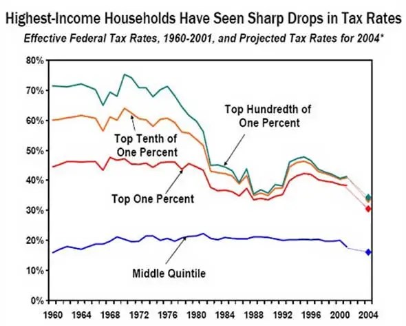
America spreads the wealth FAR LESS than other developed countries

America’s income spread is nearly twice the OECD average

Source: Economist
The gap is NOT growing in many countries, like France

Inequality is worst around Wall Street and Oil Land

If you aren’t in the top 1%, then you’re getting a bum deal

Now read…

20 Cities That Have Completely Missed The Recovery
>
>
50 Facts About The U.S. Economy That Will Shock You
- Posted on December 18, 2011 at 3:55pm by
 Becket Adams
 - Print »
- Email »
“Even though most Americans have become very frustrated with this economy, the reality is that the vast majority of them still have no idea just how bad our economic decline has been or how much trouble we are going to be in if we don’t make dramatic changes immediately,” writes The Economic Collapse (TEC).
For those unfamiliar with this site, TEC is an economic blog that regularly compiles a comprehensive list of the most startling and unsettling facts about the U.S. economy.
Why? Because Americans need to understand that U.S. economy is precariously balanced on the edge of full-blown collapse.
“If we do not educate the American people about how deathly ill the U.S. economy has become, then they will just keep falling for the same old lies that our politicians keep telling them. Just ‘tweaking’ things here and there is not going to fix this economy,” the site explains.
Indeed, America’s economic situation has become increasingly unstable. However, what’s arguably more disconcerting than the state of the U.S. economy is the fact many Americans are largely–if not completely–unaware of just how serious things have become.
“America is consuming far more wealth than it is producing and our debt is absolutely exploding,” TEC explains. “If we stay on this current path, an economic collapse is inevitable. Hopefully the crazy economic numbers from 2011 that I have included in this article will be shocking enough to wake some people up.”
It might behoove Blaze readers to share the facts listed below with family and friends.
“If we all work together, hopefully we can get millions of people to wake up and realize that ‘business as usual’ will result in a national economic apocalypse,” writes TEC.
Here are the 50 economic numbers from 2011 that will shock you (via The Economic Collapse):
1. A staggering 48 percent of all Americans are either considered to be “low income” or are living in poverty.
2. Approximately 57 percent of all children in the United States are living in homes that are either considered to be “low income” or impoverished.
3. If the number of Americans that “wanted jobs” was the same today as it was back in 2007, the “official” unemployment rate put out by the U.S. government would be up to 11 percent.
4. The average amount of time that a worker stays unemployed in the United States is now over 40 weeks.
5. One recent survey found that 77 percent of all U.S. small businesses do not plan to hire any more workers.
6. There are fewer payroll jobs in the United States today than there were back in 2000 even though we have added 30 million extra people to the population since then.
7. Since December 2007, median household income in the United States has declined by a total of 6.8 percent once you account for inflation.
8. According to the Bureau of Labor Statistics, 16.6 million Americans were self-employed back in December 2006. Today, that number has shrunk to 14.5 million.
9. A Gallup poll from earlier this year found that approximately one out of every five Americans that do have a job consider themselves to be underemployed.
10. According to author Paul Osterman, about 20 percent of all U.S. adults are currently working jobs that pay poverty-level wages.
11. Back in 1980, less than 30 percent of all jobs in the United States were low income jobs. Today, more than 40 percent of all jobs in the United States are low income jobs.
12. Back in 1969, 95 percent of all men between the ages of 25 and 54 had a job. In July, only 81.2 percent of men in that age group had a job.
13. One recent survey found that one out of every three Americans would not be able to make a mortgage or rent payment next month if they suddenly lost their current job.
14. The Federal Reserve recently announced that the total net worth of U.S. households declined by 4.1 percent in the 3rd quarter of 2011 alone.
15. According to a recent study conducted by the BlackRock Investment Institute, the ratio of household debt to personal income in the United States is now 154 percent.
16. As the economy has slowed down, so has the number of marriages. According to a Pew Research Center analysis, only 51 percent of all Americans that are at least 18 years old are currently married. Back in 1960, 72 percent of all U.S. adults were married.
17. The U.S. Postal Service has lost more than 5 billion dollars over the past year.
18. In Stockton, California home prices have declined 64 percent from where they were at when the housing market peaked.
19. Nevada has had the highest foreclosure rate in the nation for 59 months in a row.
20. If you can believe it, the median price of a home in Detroit is now just $6000.
21. According to the U.S. Census Bureau, 18 percent of all homes in the state of Florida are sitting vacant. That figure is 63 percent larger than it was just ten years ago.
22. New home construction in the United States is on pace to set a brand new all-time record low in 2011.
23. 19 percent of all American men between the ages of 25 and 34 are now living with their parents.
24. Electricity bills in the United States have risen faster than the overall rate of inflation for five years in a row.
25. According to the Bureau of Economic Analysis, health care costs accounted for just 9.5 percent of all personal consumption back in 1980. Today they account for approximately 16.3 percent.
26. One study found that approximately 41 percent of all working age Americans either have medical bill problems or are currently paying off medical debt.
27. If you can believe it, one out of every seven Americans has at least 10 credit cards.
28. The United States spends about 4 dollars on goods and services from China for every one dollar that China spends on goods and services from the United States.
29. It is being projected that the U.S. trade deficit for 2011 will be 558.2 billion dollars.
30. The retirement crisis in the United States just continues to get worse. According to the Employee Benefit Research Institute, 46 percent of all American workers have less than $10,000 saved for retirement, and 29 percent of all American workers have less than $1,000 saved for retirement.
31. Today, one out of every six elderly Americans lives below the federal poverty line.
32. According to a study that was just released, CEO pay at America’s biggest companies rose by 36.5 percent in just one recent 12 month period.
33. Today, the “too big to fail” banks are larger than ever. The total assets of the six largest U.S. banks increased by 39 percent between September 30, 2006 and September 30, 2011.
34. The six heirs of Wal-Mart founder Sam Walton have a net worth that is roughly equal to the bottom 30 percent of all Americans combined.
35. According to an analysis of Census Bureau data done by the Pew Research Center, the median net worth for households led by someone 65 years of age or older is 47 times greater than the median net worth for households led by someone under the age of 35.
36. If you can believe it, 37 percent of all U.S. households that are led by someone under the age of 35 have a net worth of zero or less than zero.
37. A higher percentage of Americans is living in extreme poverty (6.7 percent) than has ever been measured before.
38. Child homelessness in the United States is now 33 percent higher than it was back in 2007.
39. Since 2007, the number of children living in poverty in the state of California has increased by 30 percent.
40. Sadly, child poverty is absolutely exploding all over America. According to the National Center for Children in Poverty, 36.4 percent of all children that live in Philadelphia are living in poverty, 40.1 percent of all children that live in Atlanta are living in poverty, 52.6 percent of all children that live in Cleveland are living in poverty and 53.6 percent of all children that live in Detroit are living in poverty.
41. Today, one out of every seven Americans is on food stamps and one out of every four American children is on food stamps.
42. In 1980, government transfer payments accounted for just 11.7 percent of all income. Today, government transfer payments account for more than 18 percent of all income.
43. A staggering 48.5 percent of all Americans live in a household that receives some form of government benefits. Back in 1983, that number was below 30 percent.
44. Right now, spending by the federal government accounts for about 24 percent of GDP. Back in 2001, it accounted for just 18 percent.
45. For fiscal year 2011, the U.S. federal government had a budget deficit of nearly 1.3 trillion dollars. That was the third year in a row that our budget deficit has topped one trillion dollars.
46. If Bill Gates gave every single penny of his fortune to the U.S. government, it would only cover the U.S. budget deficit for about 15 days.
47. Amazingly, the U.S. government has now accumulated a total debt of 15 trillion dollars. When Barack Obama first took office the national debt was just 10.6 trillion dollars.
48. If the federal government began right at this moment to repay the U.S. national debt at a rate of one dollar per second, it would take over 440,000 years to pay off the national debt.
49. The U.S. national debt has been increasing by an average of more than 4 billion dollars per day since the beginning of the Obama administration.
50. During the Obama administration, the U.S. government has accumulated more debt than it did from the time that George Washington took office to the time that Bill Clinton took office.
Of course, after going through all these numbers, the obvious question is, “how has it come to this?” The Economic Collapse has a simple answer:
. . . the heart of our economic problems is the Federal Reserve. The Federal Reserve is a perpetual debt machine, it has almost completely destroyed the value of the U.S. dollar and it has an absolutely nightmarish track record of incompetence. If the Federal Reserve system had never been created, the U.S. economy would be in far better shape. The federal government needs to shut down the Federal Reserve and start issuing currency that is not debt-based.
But who among America’s leaders has the will and determination to do this? Judging by how the Obama administration has conducted itself thus far, it probably won’t consider (let alone implement) any of the suggestions mentioned in the above. Therefore, that leaves only the GOP candidates.
Who among them has the best chance to restore economic stability? Who is the most likely to return the U.S. to prosperity?
“Hopefully next year more Americans than ever will wake up, because 2012 is going to represent a huge turning point for this country,” TEC writes.
Indeed, 2012 may be one of the biggest turning points this country has ever seen.
(h/t Zero Hedge)
>
American Pie:
Wealth and Income Inequality in America
No matter how you slice it, when it comes to income and wealth in America the rich get most of the pie and the rest get the leftovers. The numbers are shocking. Today the top 1 percent of Americans control 43 percent of the financial wealth (see the pie chart below) while the bottom 80 percent control only 7 percent of the wealth. Incredibly, the wealthiest 400 Americans have the same combined wealth as the poorest half of Americans — over 150 million people.
According to the Center for Budget and Policy Priorities:
In 2007, the share of after-tax income going to the top 1 percent hit its highest level (17.1 percent) since 1979, while the share going to the middle one-fifth of Americans shrank to its lowest level during this period (14.1 percent).
Between 1979 and 2007, average after-tax incomes for the top 1 percent rose by 281 percent after adjusting for inflation — an increase in income of $973,100 per household — compared to increases of 25 percent ($11,200 per household) for the middle fifth of households and 16 percent ($2,400 per household) for the bottom fifth.
If all groups’ after-tax incomes had grown at the same percentage rate over the 1979-2007 period, middle-income households would have received an additional $13,042 in 2007 and families in the bottom fifth would have received an additional $6,010.
In 2007, the average household in the top 1 percent had an income of $1.3 million, up $88,800 just from the prior year; this $88,800 gain is well above the total 2007 income of the average middle-income household ($55,300).
Slate.com collects more data in an article titled “The Great Divergence In Pictures: A Visual Guide to Income Inequality.”:
Income for the top 20 percent has increased since the 1970s while income for the bottom 80 percent declined. In the 1970s the top 1 percent received 8 percent of total income while today they receive 18 percent. During the same period income for the bottom 20 percent had decreased 30 percent.
In the 1970s the top 0.1 percent of Americans received 2 percent of total income. Today they get 8 percent.
In 1980 the average CEO made 50 time more money than the average worker while today the average CEO makes almost 300 time more than the average worker.
Over the past 30 years the rich in America have become a lot richer, while many millions of Americans have seen their income stagnate or decline. As Warren Buffett, the second richest man in America, famously said, “There’s class warfare, all right, but it’s my class, the rich class, that’s making war, and we’re winning.”
Wealth and income inequality today is by far the worst in the industrialized world and has fallen in line with many Third World countries. Nobel Prize winning economist Joseph E. Stiglitz explains why this is bad news:
Some people look at income inequality and shrug their shoulders. So what if this person gains and that person loses? What matters, they argue, is not how the pie is divided but the size of the pie. That argument is fundamentally wrong. An economy in which most citizens are doing worse year after year—an economy like America’s—is not likely to do well over the long haul.
…
The top 1 percent have the best houses, the best educations, the best doctors, and the best lifestyles, but there is one thing that money doesn’t seem to have bought: an understanding that their fate is bound up with how the other 99 percent live. Throughout history, this is something that the top 1 percent eventually do learn. Too late.
Where Has All the Money Gone?
This may be the one of the most important graphs you will ever see. It show the reason for the decline of the American middle class — how the rich have become so much richer in the last 30 years and why the rest of us have been left behind:

In the post World War II period through the mid 1970s the productivity of the American worker increased at a steady rate. During this period workers were rewarded for their increased productivity with a commensurate increase in wages. Then something happened. Productivity continued to increase, but workers’ wages stagnated.
Trickle Up Economics
As Nobel Prize winning economist Paul Krugman points out, since 1973 national Gross Domestic Product (GDP) has increased 46 percent in real terms, but median income has only increased 15 percent. Where did the other 31 percent go? It went to the wealthy.
… the gap between economic growth and median incomes has a lot to do with rising inequality.
… it remains striking how little of growth has trickled down to the typical family.
Supply Side economics is the cornerstone of Republican economic theory and has driven U.S. economic policy since the Ronald Reagan presidency. This is how Investorpedia describes it:
Supply-side economics is better known to some as “Reaganomics“, or the “trickle-down” policy espoused by former U.S. president Ronald Reagan. He popularized the controversial idea that greater tax cuts for investors and entrepreneurs provide incentives to save and invest and produce economic benefits that trickle down into the overall economy.
In other words, if government economic policy focuses on making the rich richer, the benefits will “trickle down” to everyone else. As supply siders are fond of saying, “A rising tide lifts all boats.” Since Supply Side economics came to dominate American economic policy during the Reagan administration, the rising economic tide has certainly lifted a lot of yachts, but at the same time it has left most of the row boats stuck in the mud.
The past quarter century of Republican economics has proven that the trickle down theory is just a convenient excuse to justify an economic policy favoring the rich, with the benefits trickling up to make the very wealthy even wealthier.
Read More About Wealth and Income Inequality in America
Plutocracy Now
Mother Jones, Dave Gilson and Carolyn Perot
A huge share of the nation’s economic growth over the past 30 years has gone to the top one-hundredth of one percent, who now make an average of $27 million per household. The average income for the bottom 90 percent of us? $31,244.
…
The superrich have grabbed the bulk of the past three decades’ gains.

![]()
The Great Divergence in Pictures: A Visual Guide to Income Inequality
Slate.com
During the 20th century, the United States experienced two major trends in income distribution. The first, termed the “Great Compression” by economists Claudia Goldin of Harvard and Robert Margo of Boston University, was egalitarian. From 1940 to 1973, incomes became more equal. The share taken by the very richest Americans (i.e., the top 1 percent and the top 0.1 percent) shrank. The second trend, termed the “Great Divergence” by economist Paul Krugman of Princeton (and the New York Times op-ed page), was inegalitarian. From 1979 to the present, incomes have become less equal. The share taken by the very richest Americans increased.
![]()
Redistribution from the Feds? Not Really
Outside the Beltway, Alex Kanpp

Contrary to my colleague Doug’s description of the Federal government as existing primarily to redistribute wealth, there is actually very little wealth re-distribution in the United States. The chart above uses numbers I pulled from the latest CBO report showing shares of taxes, pre-tax income, and after-tax income by quintile in 2007 (last year available).
![]()
The sad but true story of wages in America
Economic Policy Institute, Lawrence Mishel and Heidi Shierholz
Recent debates about whether public- or private-sector workers earn more have obscured a larger truth: all workers have suffered from decades of stagnating wages despite large gains in productivity. The current public discussion illogically pits state and local government employees against private workers, when both groups have failed to sufficiently benefit from the economic fruits of their labors. This paper examines trends in the compensation of public (state and local government) and private-sector employees relative to the growth of productivity over the past two decades.
![]()
Wealth Inequality Destroys US Ideals
Global Balance Research, Don Monkerud
Since the national rise of Ronald Reagan three decades ago, the United States has been on a deadly course for a Republic, with wealth rapidly concentrating at the top and average Americans sinking or struggling to stay afloat.
![]()
There Was a Class War. The Rich Won It.
firedoglake.com, Ian Welsh
What happens if there’s a class war and only one side bothers to show up and fight it? That’s what happened over the last thirty years. There was a class war, and the rich won. Period. It’s over, they kicked our knees out from under us, put on their steel toed boots and spent the last thirty years telling us that they were going to trickle on us and we’re going to like it and beg for more.
…
So, if you’re an ordinary slob, you haven’t had a raise in over 30 years. In fact, your real wage peaked over 30 years ago and it’s never recovered.
 This would be ok if the US hadn’t been getting richer, getting more productive, ever since then, but I’m sure you won’t be surprised to hear that, well, actually, productivity and whatnot has kept going up. Yet somehow wages didn’t.
![]()
Beggar Thy Neighbor, Beggar Thyself
Daily Kos, Avenging Angel
Having won one class war, Republicans are starting a second. To perpetuate record levels of income inequality not seen since before the Great Depression, conservatives are agitating for middle class Americans to wage a civil war on each other. Their latest divide-and-conquer tactic is to portray government workers as “takers” and “parasites” somehow responsible for the decline of manufacturing and other sectors of the U.S. economy. Of course, like so much Republican mythmaking, the claim not only is untrue, but a cynical diversion to deflect attention from the real winners in the class war.
![]()
Income Gaps Between Very Rich and Everyone Else More Than Tripled In Last Three Decades, New Data Show
Center for Budget and Policy Priorities, Arloc Sherman and Chad Stone
The gaps in after-tax income between the richest 1 percent of Americans and the middle and poorest fifths of the country more than tripled between 1979 and 2007 (the period for which these data are available), according to data the Congressional Budget Office (CBO) issued last week. Taken together with prior research, the new data suggest greater income concentration at the top of the income scale than at any time since 1928.
…

![]()
Of the 1%, by the 1%, for the 1%
Vanity Fair, Joseph E. Stiglitz
It’s no use pretending that what has obviously happened has not in fact happened. The upper 1 percent of Americans are now taking in nearly a quarter of the nation’s income every year. In terms of wealth rather than income, the top 1 percent control 40 percent. Their lot in life has improved considerably. Twenty-five years ago, the corresponding figures were 12 percent and 33 percent.
Watch Joseph Stiglitz on Democracy Now HERE and HERE.
![]()
Widening income-productivity growth gap and inequality
Urbanomics, Gulzar
It now emerges, from the latest figures released by the BLS in the US, that changes in workers real hourly compensation has been lagging labor productivity growth. This effectively means that in relative terms, workers are getting squeezed from both side. On the one side, incomes of those at the top are exploding. On the other hand, their own incomes are not even keeping pace with productivity growth.
…

![]()
Economic Growth and Household Income
New Yrok Times, Paul Krugman
So the question is, what does account for the divergence between economic growth and median family income?
Let’s look at GDP per household versus median and mean income per household since 1973. I use households because there’s some slippage between “families” and “households”, and I didn’t want to get into all that. I end at 2007 to leave the Great Recession out of the picture. Anyway, here’s what you get:

![]()
Why we must raise taxes on the rich
Salon.com, Robert Reich
Despite an economy that’s twice as large as it was thirty years ago, the bottom 90 percent are still stuck in the mud. If they’re employed they’re earning on average only about $280 more a year than thirty years ago, adjusted for inflation. That’s less than a 1 percent gain over more than a third of a century. (Families are doing somewhat better but that’s only because so many families now have to rely on two incomes.)
![]()
Record U.S. Income Gap Widening Again
Perrspectives
In June, an analysis from the Center on Budget and Policy Priorities confirmed that gap between rich and poor in the United States reached levels not seen since 1929. Between 1979 and 2007, the yawning chasm separating the after-tax income of the richest 1 percent of Americans from the middle and poorest fifths of the country more than tripled. But while the Bush recession which began in December 2007 temporarily halted the stratospheric advance of the wealthy, the rich – and the rich alone – have largely recovered their losses. Which means that the record level of income inequality in America is growing once again.
![]()
The One-Percenters
Chicago Sun-Times, Roger Ebert
I have no objection to financial success. I’ve had a lot of it myself. All of my income came from paychecks from jobs I held and books I published. I have the quaint idea that wealth should be obtained by legal and conventional means — by working, in other words — and not through the manipulation of financial scams.
![]()
Warning! Inequality May Be Hazardous to Your Growth
IMFdirect (The International Monetary Fund’s global monetary forum), Andrew G. Berg and Jonathan D. Ostry
Some dismiss inequality and focus instead on overall growth—arguing, in effect, that a rising tide lifts all boats. But assume we have a thousand boats representing all the households in the United States, with boat length proportional to family income. In the late 1970s, the average boat was a 12 foot canoe and the biggest yacht was 250 feet long. Thirty years later, the average boat is a slightly roomier 15 footer, while the biggest yacht, at over 1100 feet, would dwarf the Titanic! When a handful of yachts become ocean liners while the rest remain lowly canoes, something is seriously amiss.
…
A rising tide is still critical to lifting all boats. The implication of our analysis is that helping to raise the lowest boats may actually help to keep the tide rising!
![]()
Taxes on the wealthy have gone down dramatically
Economic Policy Institute
 With Tax Day fast approaching and deficit reduction all the rage, one fact deserves significant attention: the wealthy are enjoying some of the lowest taxes in generations. The Figure shows the average tax rate in 1979, 1992, and 2007, as well as the tax rate for the top 1% of households, and the top 400 households (who have an average annual income of nearly $350 million). Since 1979, the country’s overall average tax rate—the share of income paid in taxes—has fallen slightly, but for those at the top of the earnings ladder this share has fallen dramatically.
…
This diminished tax burden on the wealthiest has contributed to the historically low federal revenue levels we are seeing today, and in turn, to higher deficits.
![]()
Off-the-charts income gains for super-rich
Yahoo News, Zachary Roth
 Put together by the Center on Budget and Policy Priorities, a liberal Washington think tank, the chart is pretty self-explanatory. It shows that the 30 years following the Second World War were a time of broadly shared prosperity: Income for the bottom 90 percent of American households roughly kept pace with economic growth.
…
But despite the best efforts of some commentators, there’s really no serious debate about the overall realignment of income in our age: The already super-rich have vastly increased their share of the pie–at the expense of everyone else.
![]()
Inequality Data & Statistics
inequality.org
Data from tax returns show that the top 1 percent of households in the United States received 8.9 percent of all pre-tax income in 1976. In 2008, the top 1 percent share had more than doubled to 21.0 percent.

…
The total inflation-adjusted net worth of the Forbes 400, an annual listing of America’s richest individuals, rose from $507 billion in 1995 to $1.62 trillion in 2007, before dropping back to $1.37 trillion in 2010.
…
Estimates from the Credit Suisse Research Institute, released in October 2010, show that the richest 0.5 percent of global adults hold well over a third of the world’s wealth.
…
Approximately one third of annual deaths in the United States, epidemiological researchers believe, can be credited to the nation’s excessive inequality.
![]()
Top Ten Tax Charts
Center for Budget and Policy Priorities
Taxes for the Wealthy have Fallen Dramatically

Income Gains at the Top Dwarfed Those of Everyone Else

Also on Top Ten Tax Charts:
● The United States is a Low Tax Country
● Federal Income Taxes on Average Families Are Historically Low
● Corporate Tax Revenues Are Historically Low
● Bush Tax Cuts Heavily Tilted to the Top
● Rise in Debt Could Be Halted Over the Next Decade By Letting Bush Tax Cuts Expire
● Tax Expenditures are Substantial
● Top 1 Percent’s Share of Total After-Tax Income Has More than Doubled Over the Past Thirty Years
● Most of the Budget Goes Toward Defense, Social Security, and Major Health Programs
![]()
Income Gap Between Rich, Poor the Widest Ever
CBS News
The top-earning 20 percent of Americans – those making more than $100,000 each year – received 49.4 percent of all income generated in the U.S., compared with the 3.4 percent earned by those below the poverty line, according to newly released census figures. That ratio of 14.5-to-1 was an increase from 13.6 in 2008 and nearly double a low of 7.69 in 1968.
A different measure, the international Gini index, found U.S. income inequality at its highest level since the Census Bureau began tracking household income in 1967. The U.S. also has the greatest disparity among Western industrialized nations.
![]()
The Top 10 Tax Breaks — And How They Help The Wealthy The Most
Huffington Post, Dan Froomkin and Jake Bialer
The government spends money through appropriations and writing checks, but it also showers individuals and companies with a astonishing array of special exemptions, credits and deductions that amount to a $1.1 trillion giveaway each year. (For comparison: the big budget fight that concluded last week cut spending by about $38 billion.)

![]()
Supply-Side Failure from Theory, to Outcomes, to Danger of Citizens United Decision
Art on Issues, Dr. Art Kamm
Republican tax cut/deregulation (supply-side) policy assumes the United States to be a closed economic system where the benefit remains in America when in fact we invest in a global economy. A critical break occurred in supply-side theory when enhanced savings from tax cuts was not followed by increased US capital investment. The failure of this policy to stimulate US business investment contributes to its underperformance in jobs creation, job recovery following recession, GDP growth, real annual median household income growth and wage levels. Without economic stimulative effects from this policy, the loss of tax revenue from tax cuts was not offset by increased tax receipts from economic growth and our national debt has substantially increased as a fraction of our economy under all five complete 4-year periods where this policy has been in effect since 1981. With no control over where the wealthy and corporations deploy their capital, the money we borrowed to support tax cuts largely favoring the wealthy has supported job creation and business growth abroad while our job creation has lagged at home.
[Emphasis added]
Median U.S. household income fell 5% between 1999 and 2009. Globalization remains the core problem
Daily Kos, Meteor Bladesd
 Technologically induced productivity whose benefits are only partially (if at all) passed along to workers. Union busting. Squeezing workers to do more with less (which was something some hotshot facilitator at a management seminar once called “work smarter, not harder” before that insulting slogan went viral). Erosion of the buying power of the minimum wage. A deteriorating manufacturing base abetted by “free trade” agreements that pit Americans against workers in China, India and elsewhere who earn 10 percent at companies which can compete without bothering with safety and environmental regulations. The sum? One of the plagues of the U.S. economy during the past few decades: stagnant wages.
…
In the view of multitudes of corporate CEOs and the folks at the American Enterprise Institute and its ideological compatriots, the market is working just fine. As traditionally measured, that’s true. A multinational operation that maintains efficiency and manages, for instance, to sell plenty of cars at a good profit around the planet is doing what such enterprises are supposed to do. It’s no skin off a shareholder’s nose if new employees are hired at half the rate their predecessors were and the benefits they receive are trimmed. If they can no longer afford, as they could working for Henry Ford, to buy one of the cars they make, so what? And it doesn’t matter to shareholders if jobs are exported where workers paid 20 percent of what Americans receive can build cars just as efficiently. Or computers. Or televisions. Or software. You name it. If it doesn’t matter to those own the stock, it certainly doesn’t matter to the CEOs.
[Emphasis added]
![]()
Income Inequality: Too Big to Ignore
New Youk Times, Robert H. Frank
People often remember the past with exaggerated fondness. Sometimes, however, important aspects of life really were better in the old days.
During the three decades after World War II, for example, incomes in the United States rose rapidly and at about the same rate — almost 3 percent a year — for people at all income levels. America had an economically vibrant middle class. Roads and bridges were well maintained, and impressive new infrastructure was being built. People were optimistic.
By contrast, during the last three decades the economy has grown much more slowly, and our infrastructure has fallen into grave disrepair. Most troubling, all significant income growth has been concentrated at the top of the scale. The share of total income going to the top 1 percent of earners, which stood at 8.9 percent in 1976, rose to 23.5 percent by 2007, but during the same period, the average inflation-adjusted hourly wage declined by more than 7 percent.
[Emphasis added]
![]()
America Is Not a Third World Country – Yet
The National Ledger, Froma Harrop
If low taxes are the key to economic growth, as Republicans claim, why aren’t we doing better? What explains the phenomenal growth of the 1950s, when the top marginal rate hit 91 percent? Or the years following the Democrats’ 1993 tax hike on high incomes, when the economy boomed, the budget ran a surplus and the rich did better than ever?
The Republican House budget offers a Third World vision for America. More tax cuts for the jet-setters. Fewer government guarantees for those below them. The plan would curtail health care programs for the elderly and poor, law enforcement, environmental regulation, and nutrition programs for women and children. And they would repeal the Democrats’ health care reforms guaranteeing coverage to all, even though they would reduce deficits over time.
![]()
The Very Rich Really Are Different
Tax Policy Center, Roberton Williams
“Let me tell you about the very rich. They are different from you and me,” wrote F. Scott Fitzgerald. He wasn’t talking about taxes (the laws were very different back in 1926) but his assertion certainly applies to the way the wealthy fare under today’s tax law.
…

![]()
Middle-Class Americans More Productive, But Earning Less: Report
Huffington Post, Janell Ross
American workers’ productivity has soared over the last 30 years, but that extra output hasn’t translating into higher earnings for the American middle class, according to a report released this week.
…
As middle-class Americans have lost out economically over that 30 year period, productivity, corporate profits and the incomes of America’s rich have all soared, the report said. By 2009, 1 percent of the population lived on 21 percent of the nation’s total annual earnings.

[Chart by he Employment Policy Research Network]
![]()
The big debt lie: After three decades of failed experiments, you’d think we might finally give up on supply-side economics
Salon, Gene Lyons
The betting system the GOP’s been playing for the past 30 years is called supply-side economics. “The theory goes like this,” explains David Cay Johnston. “Lower tax rates will encourage more investment, which in turn will mean more jobs and greater prosperity — so much so that tax revenues will go up, despite lower rates.”
To anybody with a passing interest in the material world, it’s clear that this has never happened. Over the same period, the national debt has risen to more than $14 trillion — almost 90 percent of it under Republican presidents.
![]()
Why More Equality?
The Equality Tust
Our thirty years research shows that:
1) In rich countries, a smaller gap between rich and poor means a happier, healthier, and more successful population. Just look at the US, the UK, Portugal, and New Zealand in the top right of this graph, doing much worse than Japan, Sweden or Norway in the bottom left.

![]()
Warren Buffett: ‘Trickle Down’ Theory Hasn’t Worked (VIDEO)
Talking Points Memo
“The rich are always going to say that, you know, just give us more money and we’ll go out and spend more and then it will all trickle down to the rest of you. But that has not worked the last 10 years, and I hope the American public is catching on,” Buffett said in the clip from ABC News’ “This Week with Christiane Amanpour.”
…
 http://abcnews.go.com/assets/player/walt2.6/flash/SFP_Walt_2_65.swf
![]()
With executive pay, rich pull away from rest of America
Washington Post with Bloomburg Business , Special Report: Breakaway Wealth
Whatever people think of it, the gap between the very highest earners and everyone else has been widening significantly.
Income inequality has been on the rise for decades in several nations, including the United Kingdom, China and India, but it has been most pronounced in the United States, economists say.
In 1975, for example, the top 0.1 percent of earners garnered about 2.5 percent of the nation’s income, including capital gains, according to data collected by University of California economist Emmanuel Saez. By 2008, that share had quadrupled and stood at 10.4 percent.
The phenomenon is even more pronounced at even higher levels of income. The share of the income commanded by the top 0.01 percent rose from 0.85 percent to 5.03 percent over that period. For the 15,000 families in that group, average income now stands at $27 million.
In world rankings of income inequality, the United States now falls among some of the world’s less-developed economies.
[Emphasis added]
![]()
(Not) spreading the wealth
Washington Post with Bloomburg Business , Special Report: Breakaway Wealth
The income gap between the wealthy and the rest of the country has grown along with dramatic increases in CEO pay.
Inequality in the U.S. has has grown steadily since the 1970s, following a flat period after World War II. In 2008, the wealthiest 10 percent earned almost the same amount of income as the rest of the country combined.
…

Plus three more charts.
![]()
The world’s richest are richer than before the crisis
Salon, Natasha Lennard
The wealth report highlights the uneven way that the economic recovery is playing out: the net worth of the wealthy has not trickled down to prop up global economies, as the U.S. fiscal deficit and sovereign debt crisis in Europe shows. However, the rich getting richer has funneled into the luxuries industry.
![]()
World’s wealthiest people now richer than before the credit crunch
guardian.co.uk, Jill Treanor
The globe’s richest have now recouped the losses they suffered after the 2008 banking crisis. They are richer than ever, and there are more of them – nearly 11 million – than before the recession struck.
…
According to the annual world wealth report by Merrill Lynch and Capgemini, the wealth of HNWIs around the world reached $42.7tn (£26.5tn) in 2010, rising nearly 10% in a year and surpassing the peak of $40.7tn reached in 2007, even as austerity budgets were implemented by many governments in the developed world.

![]()
The final nail in the supply side coffin
Salon, Andrew Leonard
In the first quarter of 2011, aggregate U.S. GDP — the total value of all the goods and services produced in the United States — was higher than the peak reached before the recession began in 2007. During the six quarters since the recession technically ended in the second quarter of 2009, real national income in the U.S. increased by $528 billion. But the vast majority of that income was captured as profit by corporations that failed to pass on their happy fortunes to their workers.
…
Wages are moribund, unemployment is stuck at 9 percent, and the corporate bottom line is doing just fine. You could be excused for thinking that if ever there was time to put the stake through supply-side economics, it would be now. Wall Street and big corporations are doing just fine, but absolutely nothing is trickling down. And yet Republicans are still pushing the same old song and dance, passionately holding the entire creditworthiness of the United States hostage in return for even lower taxes on corporations, adamantly refusing to countenance even the slightest revenue increase to help cushion the hard times for the Americans who are getting a raw deal out of the current recovery.
![]()
Who Has Benefitted from the Post-Great Recession Recovery? A New Look at the Growth Performance of Jobs, Wages, Corporate Profits, and Stock Price Indices During the First Two Years of Recovery
Center for Labor Market Studies; Andrew Sum,Joseph McLaughlin
Not one of these five groups of full-time wage and salary workers received a real earnings boost over this two year period. Each group experienced a modest weekly wage decline of 1 to 2 per cent over this period with the top two wage groups actually faring slightly worse. Over the entire decade (2001 I – 2011 I), those workers at the top (90th percentile) obtained a real weekly wage increase of $92 or 6% while those at the bottom (10th percentile) experienced a wage loss of 1%. The lost decade did not generate any substantive improvement in the real weekly earnings of the vast majority of U.S. workers.
…
In contrast to the absence of any growth in aggregate wages and salaries or in the mean or median hourly and weekly wages of individual workers, corporate profits have experienced very strong growth over the recovery (Table 4). Annualized corporate profits exploded from the second quarter of 2009 to the second quarter of 2010, growing by more than $410 billion, and increased further to $1.694 billion in the first quarter of 2011. During the first seven quarters of recovery, corporate profits rose by $491 billion or 41%. A substantial jump in labor productivity (of 9%) from the last quarter of 2008 to 2011 I with no increase in real wages provided the major portion of the boost in corporate profits. The link between productivity growth and real wage growth was completely separate.
…

…
The recovery from the Great Recession has been highly uneven in its effects on workers, wages, profits, stock prices, and savers (bank savings accounts, money market accounts, CDs). Many U.S. adults, especially from low income and middle income households, have reported to poll takers that the U.S. is still in a recession or depression.11 From their vantage point, it still is. The same cannot be said for corporate profits, the CEOs of large corporations, or for those with large stock holdings. The disparities in economic rewards are the largest ever seen in a post World War II recovery.
![]()
REPORT: In 12 Years, Income For Richest 400 Americans Quadruples, Tax Rate Nearly Halved
Think Progress; Scott Keyes
New data released by the IRS reveals that, over a period of 12 years, tax rates for the richest 400 Americans were effectively cut in half. In 1995, the richest 400 Americans paid, on average, 29.93% of their income in federal taxes. In 2007, the last year for which the IRS has released data, the richest 400 Americans paid just 16.63%.
…

…

![]()
Inequality Is Most Extreme in Wealth, Not Income
New York Times; Catherin Rampell
Here’s a chart I put together showing what percentage of all of America’s income (including capital gains) is going to each of several income classes, today versus previous years:

Pretty striking, right? As of 2008, about 21 percent of income was received by just 1 percent of earners.
But economic inequality isn’t just about how much you make — it’s about how much you have.
To that end, the Economic Policy Institute, a liberal research organization, has published a new report looking at disparities in wealth in the United States.
It includes this chart, showing estimates of what share of wealth each class claims:

Remember that wealth accumulates over time. The highest earners are able to save much of their incomes, whereas lower earners can’t. That means high earners can accumulate more and more wealth as time goes on (assuming they don’t blow it all, of course).
![]()
Graphing Rising Income Inequality, the Trademark of Neoliberalism
Daily Kos; tote
There are three ways to measure global income inequality. The first measures inequality of incomes between states as a whole, regardless of their population size. The second adjusts the first to take account of states populations, hence a slightly more personal measure of actual Global inequality; the third and best measure is total global inequality, treating every person as individual across the globe. The most widely accepted measure of inequality is the Gini Coefficient, which simply measures statistical dispersion. The higher the gini coefficient, the higher the inequality within a system. Here is the Global Gini Coefficient from 1950 to 1998 using the third measure in inequality, that between each individual person on the planet:

What this remarkable graph shows is a spike in global inequality that began in 1984 and rose to an unprecedented level. Between 1964 and 1984, there were global workers struggles, there was civil rights legislation, there were regulatory apparatuses in place to prevent major economic crises. Since 1984, that relative level of equity has rapidly vanished, and today we are living in a more unequal world than ever before.
![]()
Winner-Take-All Politics: Public Policy, Political Organization, and the Precipitous Rise of Top Incomes in the United States
Politics & Society, Jacob S. Hacker and Paul Pierson
That income inequality has grown substantially over the past thirty years is no longer in dispute. Yet persistent confusion remains about the exact nature of this change and its main causes. Indeed, these two sources of confusion are linked, since properly identifying the character of American inequality is essential to offering convincing explanations of its rise.
As we show in this section, the three crucial features of growing U.S. inequality are that (1) economic gains have been highly concentrated at the very top; (2) these lopsided gains have been sustained, growing virtually without interruption since around 1980; and (3) these gains have resulted in few “trickle-down” benefits for most of the population. Together, these three features call into question standard economic accounts of rising inequality that focus on gaps between broad groups based on rising returns to education and skills. They also call into question the leading political science accounts of rising inequality taken up in the next section, which also tend to focus on the growing distance between the top and bottom thirds of the population rather than the pulling away of the very affluent.
![]()
Wealth and Income Inequality: America’s Moral Crisis
Art on Issues, Dr. Art Kamm
As more income has been pushed to the top over the past 30 years, the income growth of the middle class, and thus its purchasing power, has not kept pace with the growth of the economy. Quintile by quintile, the lower 80 percent of America is down almost $10,000/yr in income distribution since 1979 while the upper 1% is up over $740,000 in average income during that same timeframe. And with an economy that is 70% personal consumption, this has resulted in weaker demand for goods and services and thus slow recovery and higher unemployment (ref).

But graphs and charts do a disservice in showing what is really happening with wealth and income inequality in America. The actual dollar increases in income and wealth in recent years within the top 0.1% of income earners, as well as the rapidly growing sums of money held within that group, are mind-staggering; perhaps obscene is a better word during these economically troubled times. And that will be thrust of this article. It will compare and contrast increases in wealth and income at the top versus the extent and effects of growing poverty (including death) and unemployment in the rest of America. The failure to share sacrifice at the top while pursuing cuts in programs benefitting the victims of the recession, represents nothing less than a moral crisis for our country.
![]()
15 Mind-Blowing Facts About Wealth And Inequality In America
Business Insider
The gap between the top 1% and everyone else hasn’t been this bad since the Roaring Twenties

![]()
Reagan Revolution Home To Roost — In Charts
Campaign for America’s Future
It seems that you can look at a chart of almost anything and right around 1981 or soon after you’ll see the chart make a sharp change in direction, and probably not in a good way. And I really do mean almost anything, from economics to trade to infrastructure to … well almost anything. I spent some time looking for charts of things, and here are just a few examples. In each of the charts below look for the year 1981, when Reagan took office.
Conservative policies transformed the United States from the largest creditor nation to the largest debtor nation in just a few years, and it has only gotten worse since then:

Working people’s share of the benefits from increased productivity took a sudden turn down:

[Emphasis in original]
Surprise! Census Data Contains Good News… For The Rich
Political Correction, Jamison Foster
Today’s Census Bureau release of household income data contains some awfully gloomy numbers: The nation’s poverty rate is 15.1 percent, the highest since 1993, and median household income in 2010 was only $369 higher than in 1989.
But, as usual, the new data contains some good news… for the rich. Here’s a chart showing mean household income from 1978 to 2010 for the bottom, middle, and top quintiles:

Huge disparity in share of total wealth gain since 1983
Political Correction, Jamison Foster
… wealth is now lower for the typical household than it was a generation ago in 1983, while the wealth at the upper end expanded a great deal.
…
In other words, the richest 5 percent of households obtained roughly 82 percent of all the nation’s gains in wealth between 1983 and 2009. The bottom 60 percent of households actually had less wealth in 2009 than in 1983, meaning they did not participate at all in the growth of wealth over this period.

Equality and Efficiency
International Monitary Fund, Andrew G. Berg and Jonathan D. Ostry
Do societies inevitably face an invidious choice between efficient production and equitable wealth and income distribution? Are social justice and social product at war with one another?
In a word, no.
…
It may seem counterintuitive that inequality is strongly associated with less sustained growth. After all, some inequality is essential to the effective functioning of a market economy and the incentives needed for investment and growth (Chaudhuri and Ravallion, 2007). But too much inequality might be destructive to growth. Beyond the risk that inequality may amplify the potential for financial crisis, it may also bring political instability, which can discourage investment. Inequality may make it harder for governments to make difficult but necessary choices in the face of shocks, such as raising taxes or cutting public spending to avoid a debt crisis. Or inequality may reflect poor people’s lack of access to financial services, which gives them fewer opportunities to invest in education and entrepreneurial activity.

![]()
The Lost Decade for the Middle Class
On the Economy, Jared Bernstein

…
It is a mantra among economists that the growth of productivity translates into the an increase in society’s living standards. But what if that growth eludes the middle class and the poor? The productivity mantra is an average mantra—it does not account for the growth of income inequality.
Today’s Census data show that since median HH inc peaked in 1999, the amount of income loss you suffered was very much a function of where you were in the income scale…the higher the better, or the least worst, I should say. Here’s a little table of household income changes at various percentiles (not that these Census data leave out realized capital gains, which play a large and important role in the increase in inequality.

…
These Census results should force us to be very clear eyed in recognizing that markets sometimes fail and when they do so, the federal gov’t must fill two very important roles.
![]()
CHARTS: Here’s What The Wall Street Protesters Are So Angry About…
Business Insider, Henry Blodget
The problem in a nutshell is this: Inequality in this country has hit a level that has been seen only once in the nation’s history, and unemployment has reached a level that has been seen only once since the Great Depression. And, at the same time, corporate profits are at a record high. In other words, in the never-ending tug-of-war between “labor” and “capital,” there has rarely—if ever—been a time when “capital” was so clearly winning.
Let’s start with the obvious: Unemployment. Three years after the financial crisis, the unemployment rate is still at the highest level since the Great Depression (except for a brief blip in the early 1980s)

![]()
Income Distribution: Poor, Rich, And Richest [GRAPHIC]
Huffington Post
In 2008, the top 0.01 percent of earners controlled 5 percent of the nation’s wealth, as depicted by Catherine Mulbrandon at Visualizing Economics. At the same time the bottom 90 percent of earners’ share of income was slightly over half.
But the gap between the super-rich and everyone else wasn’t always so wide. Indeed, the share of income belonging to the top 1 percent of earners in the U.S. more than doubled between 1982 and 2008, according to the Wall Street Journal.
…

![]()
The Shocking, Graphic Data That Shows Exactly What Motivates the Occupy Movement
Alternet, Les Leopold
What are the Occupy Wall Street protesters angry about? The same things we’re all angry about. The only difference is the protestors turned their anger into public action. Occupy Wall Street lit the embers and the sparks are flying. Whether it turns into a genuine populist prairie fire depends on all of us.
Now is not the time for wonky policy solutions, as the media meatheads are calling for. Rather, it’s time to air our grievances as loudly as possible, which is precisely what Wall Street and its minions fear the most. Here’s a brief list of why we should be angry and the charts to back it up.
1. The American Dream is imploding…

![]()
Income Inequality Reaches Gilded Age Levels, Congressional Report Finds
Huffington Post, Alexander Eichler and Michael McAuliff
America’s 99 percent are not just imagining it. The gap between the incomes of the rich and poor in this new Gilded Age is strikingly broad and deep, according to an October report from Congress’ data crunchers.
…

![]()
Why inequality in America is even worse than you thought
Salon, Justin Elliott
There has been no shortage of headlines this week about the growing income and wealth inequality in the United States. A new study from the Congressional Budget Office, for example, found that income of the top 1 percent of households increased by 275 percent in the 30-year period ending in 2007. American households at the bottom and in the middle, meanwhile, saw income growth of just 18 to 40 percent over the same period
But less attention has been paid to the fact that not only are the numbers bad in America, they’re particularly bad when compared to other developed nations.
A new report (.pdf) by the Bertelsmann Foundation drives this point home. The German think tank used a set of policy analyses to create a Social Justice Index of 31 developed nations in the Organisation for Economic Co-operation and Development (OECD). The United States came in a dismal 27th in the rankings. Here, for example, is a graph of one of the metrics, child poverty, in which the U.S. ranked fourth-to-last (click for larger size):

![]()
Why income inequality suddenly matters
Salon, David Sirota
For most of the post-World War II era, we tolerated relatively high inequality because we envisioned it as a necessary side effect of an exceptional economy that (supposedly) guaranteed opportunities for advancement. As the Wall Street Journal put it, we believed that “it is OK to have ever-greater differences between rich and poor … as long as (our) children have a good chance of grasping the brass ring.”
However, the last three decades have invalidated our standing hypothesis. After the conservatives’ successful assault on the New Deal, America has lived a different reality — one perfectly summarized by a new Federal Reserve study revealing that today’s increasing inequality accompanies comparatively low social mobility.
“U.S. family income mobility has decreased over the 1969-2006 time span, and especially since the 1980s,” notes the Fed paper, adding that “a family’s position at (the) end of (the) 2000s was … more correlated with its start position than was the case 20 years earlier.”
Of course, some class mobility still exists. The trouble is that it’s primarily of the downward kind. As the Pew Charitable Trusts reports, roughly a third of those who grew up in the middle class have now fallen below that station in adulthood.
This is why, for all the right-wing mythology about “Eurosocialism” snuffing out upward mobility, data from the Organization for Economic Cooperation and Development show that social mobility in uber-capitalist America is actually lower than in most industrialized countries.
![]()
Debunking the conservative argument about the rich and taxes, in three easy charts
Washington Post, Greg Sargent
But here’s the rub: The overall income of the top 1 percent has risen significanly faster than that over the same time period. The second chart shows that the percentage change of the overall average income of the top one percent has risen by 119 percent. That’s more than twice the amount of the change in their income tax, which grew by 54 percent in that time:

![]()
For Business, Golden Days; For Workers, the Dross
New York Times, Floyd Norris
In the eight decades before the recent recession, there was never a period when as much as 9 percent of American gross domestic product went to companies in the form of after-tax profits. Now the figure is over 10 percent.
During the same period, there never was a quarter when wage and salary income amounted to less than 45 percent of the economy. Now the figure is below 44 percent.
For companies, these are boom times. For workers, the opposite is true.
…

Note: Personal taxes includes state and local income taxes, taxes on personal property and employee share of payroll taxes
Source: Bureau of Economic Analysis, via Haver Analytics
![]()
Recession’s Brief Dip in Income Inequality is Already Over
Perrspectives
With the rise of the Occupy movement and confirmation from the nonpartisan CBO that the U.S. income gap is at its highest level since 1929, defensive conservatives by necessity spawned a thriving if laughable cottage industry in income inequality denialism. Now with word from the New York Times that the share of income for the top 1 percent dropped from 23 to 17 percent between 2007 and 2009, you can expect more cries of “so get a time machine, Occupy Wall Street!”
But the right-wing echo chamber need not worry about the plight of the tragically rich. While working Americans continue to struggle as the economy slowly recovers from the Bush recession, the rebound of Wall Street has ensured that the upper crust has already recouped its losses. As the data show, millionaires are not only making a rapid comeback. For the gilded class, the economic downturn is already over.
Seizing on federal tax data showing that the average income for the top 1 percent fell to $957,000 in 2009 from $1.4 million in 2007, conservatives have complained that income inequality is so over:
Analysts say the drop largely reflects the stock market plunge, and most think top incomes recovered somewhat in 2010, as Wall Street rebounded and corporate profits grew. Still, the drop alters a figure often emphasized by inequality critics, and it has gone largely unnoticed outside the blogosphere.
By focusing on the top 1 percent, the Occupy Wall Street movement has made economic fairness a subject of street protest and political debate.
“It’s very interesting that this has become such a big topic now when the numbers are back to where they were in the 1990s,” said Steven Kaplan, an economist at the University of Chicago’s business school. “People didn’t seem to be complaining about it then.”
That might have been because during the 8-year Clinton boom that generated 23 million new jobs, the rising tide for once did lift all (or at least most) boats. But after the Bush recession that started in December 2007, many Americans’ dinghies were capsized by yachts once again cruising at full speed. As it turns out, the recession that has proved so devastating for most Americans for the wealthy has been merely a hiccup.

![]()
Changes in the Distribution of Income Among Tax Filers Between 1996 and 2006: The Role of Labor Income, Capital Income, and Tax Policy
Congressional Research Service
Summary
This report examines changes in income inequality among tax filers between 1996 and 2006. In particular, the role of changes in wages, capital income, and tax policy is investigated.
Inflation-adjusted average after-tax income grew by 25% between 1996 and 2006 (the last year for which individual income tax data is publicly available). This average increase, however, obscures a great deal of variation. The poorest 20% of tax filers experienced a 6% reduction in income while the top 0.1% of tax filers saw their income almost double. Tax filers in the middle of the income distribution experienced about a 10% increase in income. Also during this period, the proportion of income from capital increased for the top 0.1% from 64% to 70%.
Income inequality, as measured by the Gini coefficient, increased between 1996 and 2006; this is true for both before-tax and after-tax income. Before-tax income inequality increased from 0.532 to 0.582 between 1996 and 2006—a 9% increase. After-tax income inequality increased by 11% between 1996 and 2006. Total taxes (the individual income tax, the payroll tax, and the corporate income tax) reduced income inequality in both 1996 and 2006. In 1996, taxes reduced income inequality by 5%. In 2006, however, taxes reduced income inequality by less than 4%. Taxes were more progressive and had a greater equalizing effect in 1996 than in 2006.
Three potential causes of the increase in after-tax income inequality between 1996 and 2006 are changes in labor income (wages and salaries), changes in capital income (capital gains, dividends, and business income), and changes in taxes. To evaluate these potential reasons for increasing income inequality, a technique to decompose income inequality by income source is used. While earnings inequality increased between 1996 and 2006, this was not the major source of increasing income inequality over this period. Capital gains and dividends were a larger share of total income in 2006 than in 1996 (especially for high-income taxpayers) and were more unequally distributed in 2006 than in 1996. Changes in capital gains and dividends were the largest contributor to the increase in the overall income inequality. Taxes were less progressive in 2006 than in 1996, and consequently, tax policy also contributed to the increase in income inequality between 1996 and 2006. But overall income inequality would likely have increased even in the absence of tax policy changes.
![]()
>

Leave a comment